[Graphics]Creating a SMAC(X) Faction Logo
| Submitted By:
Buster's Uncle
Date: October 14, 2012, 05:31:55 PM
Views: 1038
|
Creating a SMAC(X) Faction Logo
As has become my recent practice, I’ll be giving details of which buttons I pushed in GIMP - for instructional purposes, it seems to be the best choice for a powerful graphics program available for free to all…
So, for the SMACivilization SpaceMayans (the Astral Jaguar Cult) faction logo, I chose this shot out of several Alexander had posted:
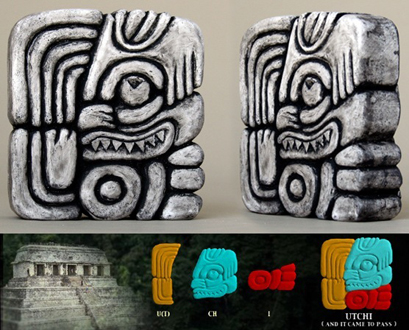
It was perfect for our needs and wouldn’t be difficult to convert.
I cropped it down to the full-color shot in the corner

(Rectangle Select Tool to make a box>Image>Crop To Selection). I cranked up the contrast 60% and darkened 30% (Colors>Brightness-Contrast) to bring up the black lines, mostly. We’d talked about making the blue green, so I selected that part (Fuzzy Select Tool with Threshold at 105) and hue-shifted (Colors>Hue-Saturation>top (Hue) slider moved left until it was very green (-45 in this case)). The yellowish part was looking distinctly orange now, so I did the same there (selecting it took more time at lower power because the red part wanted to select, too - I had to click on the yellowest pixels, then change the Fuzzy Select Mode to Add to the current selection at a threshold of 25) then (Colors>Hue-Saturation>Hue +30). I was going for a typically Mexican color scheme, too, thus green and yellow instead of blue and orange.
Then to get rid of the black border and give me a transparent background to work with later, (Layer>Transparency>Add Alpha Channel. Fuzzy Select Tool at threshold 41 selecting the black background>[Delete].) I cropped out all that superfluous border (Image>Autocrop Image) and deselected the empty space left. Because I wanted to bring up the contrast again to bring out the lines, and raising contrast brings up the color saturation, I lowered the color levels in advance (Colors>Hue-Saturation>bottom (Saturation) slider -50%). Then Colors>Brightness-Contrast>Contrast +70%.

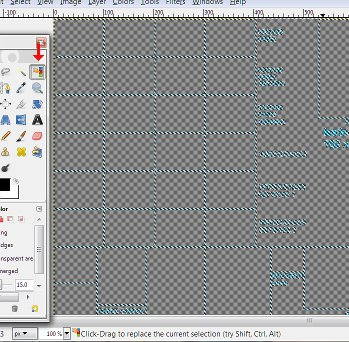
Then I loaded the SMACX palette to see if I was done yet (Image>Mode>Indexed…>checked Use custom palette>clicked on my palette file>unchecked Remove unused colors from color map>Convert) and I nearly was. I Scaled the pink Eraser Tool down to 0.01 in the Toolbox and clicked Hard edge, zoomed in and spent a minute erasing some very dark pixels around the edge.

The difference from the last shot doesn't jump out at you, but matters. If you're not able/willing to nit-pick the fine details, you'll not make a very good grapics modder.
Now, time to paste it in. I loaded blankpcx.pcx, Layer>Transparency>Add Alpha Channel, Select by Color Tool>click on the background purple>Delete.
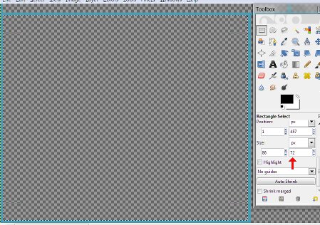
I went back to the GIMP window with the logo I‘d just prepared, [Ctrl]a>[Ctrl]c, went back to blank, zoomed in on the upper Council Logo box, the largest, selected the inside of the box to measure how much space I had, (86wX72h - who can remember?)
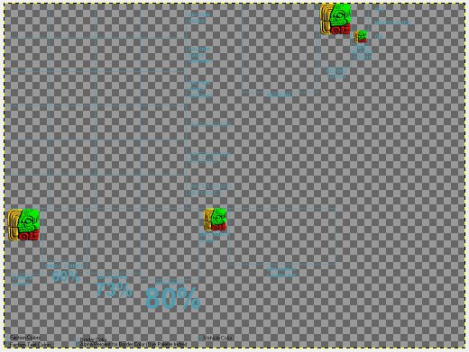
And pasted the logo in ([Ctrl]v) - surprisingly, it was already the right size. That’s never happened before.
I repeated the process at the upper Report Logo box - it was one pixel too tall to fit, so Layer>Scale Layer>reduce by one>deselect (Reduced proportionally{just as well leave this one square}. Deselect to drop it in.) Then repeated the same process in the lowest Small Report Logo box, and the Diplomacy Logo box, being careful to center it.
And then I saved as AstralJaguarCult.png (.png to preserve the transparent background until I’m ready to save the final .pcx copy). I was done with this stage (I’ll come back to this later and make the duller versions for the other boxes when I get to the scanline part) unless Alexander wanted the logo more “outer space” when he sees it, in which case I’ll suggest superimposing a (sacrificial) dagger w/ a glowing light saber-ish blade. That should also keep me from having to re-do any of this…
Like most things graphical, I just took hours explaining something I could have done in minutes - it only sounds difficult because I explain in such tedious detail for instructional purposes. Logos are the easiest part -though this one was easier than most, and sometimes I just draw something, which I couldn‘t do well enough with bases, portraits and landscapes- you can do this.
|
Rating: This article has not been rated yet.
|
|
|
Comments
|


