![]()
![]()
|
[Graphics]
If creating/modifying
graphics doesn’t interest you I doubt this will.
My specific examples are from Alpha Centauri, but most of the techniques, and all of
the comments about the thinking behind the artistic process and decisions should be
universally applicable. The THINKING, in fact, is the main thing in this old article
that is still useful.
My first purpose here is to give potential graphics guys a leg up, so I have to go
into torturous detail to be really helpful, as I don’t know what they do or do not
already know how to do. I don’t have a sophisticated graphics set-up at all, and do a
lot the hard way in simple, common programs, but that makes it more universal, albeit
perhaps often extraneous to someone with PhotoshopUltimateSuper 2020. (Also note
that if you have Windows7, most of the comments about MS Paint no longer apply, but many
of the techniques will still work in other programs.)
You have been warned.
So, while working on the New Vikings (an alt. Pirates faction) today, I started a
little status report with a name suggestion to send Darsnan, but things went pretty
smoothly, and it turned into running notes to send with the graphic instead…
It occurred to me that a few months (years now) ago while I was a lurker looking for
information about various things I wanted to learn to do, I would have loved it if someone
had posted about their creation process in really boring detail, naming programs used and
tools, and what-not.
And I thought that the bulk of the email [with the blow-by-blow I didn’t waste
Darsnan’s time on added in brackets] would make a start.
So I’m going to try to describe the entire actual creation of an faction
graphic- we’re in for a long post(s)...
I hope my process will be at least of some interest to any other artists currently
active, too.
***
[Darsnan had suggested a name, Ulrik Magnussen, that sounded, not Finnish to me, but
Norwegian. (Graphics stuff is coming- it’s all connected, anyway.)]
A Finnish name site was first hit when I looked. Because the original subject of the
portrait I’d chosen was apparently named Jim, I chose a j name, Jali (yahlee), for no
Jim-looking equivalent at hand, its exoticness and that it doesn’t sound as much like
a chick’s name as many on that list.
Magnus was first in the M’s, so I’d say Jali Magnus was a lock, if
you’ve nothing to add. Easy to remember, spell and type, too.
[I’d already cranked up the contrast in Photoshop on the bases he’d sent me
this morning .
[They were Network Node’s work, and like a lot of his bases, pretty and
well-designed, but to my eye, too pastel-looking to look realistic in the game.
[(Looking at it over a year later, I should have gone to the trouble to clean up all
those light pixels around the edges of the bases. They really stand out when you zoom in;
small details are important if you want to do good work.
[(In fact, I now think I really muffed fixing up on this set; if I did it over,
I‘d zoom in tight and do something about all the speckle-y highlight-and-dark bits
all over the base {which cranking up the contrast made even worse} with careful use of the
smudge tool to smooth out the flat surfaces to let the details and lines of the base stand
out more - tedious work, one pixel at a time, but again, attention to detail is everything
in good art.)
[Then I selected the lot and pasted them into the copy of the whole Pirates .pcx
I’d previously pasted into MS Paint. I use paint for this because it’s not
something Photoshop 5 is any good for- Paint lets you move your paste around before you
drop it. GIMP is good for that, though, and if you have Windows7, you can no longer
do this in Paint - no “Draw Opaque“ function anymore.
[Then I opened the blank .pcx (you can get it here) with the empty AC graphics boxes that Maniac had
posted sometime in the past in Photoshop (all I began using Photoshop for was opening and
saving, and did all the work pasting back and forth between Paint and Lexmark Photo
Editor, which complement each other nicely used this way- if either did color manipulation
I’d have never gone to the trouble to learn how to use Photoshop). I zoomed on the
datalink leaderhead box and selected/copied it. I switched to a second copy of Paint in
which was waiting the portrait I’d prepared. (A blow-by-blow of that kind of thing is
enough for its own post later.)
[I pasted in the box from blankpcx.pcx, right-clicked the sample tool in the middle
to make the .pcx’s background color this copy of Paint’s background color. I
then turned off “Draw Opaque” and hit [Ctrl]z to undo and make the purple-filled
box go away. I then [Ctrl]w-ed to resize the image- there were several minutes of trial
and error before I found 55% to be ideal for getting what I wanted of the figure to fit in
the diplomacy box at what I judged was a good size for the game - ideally you want to get
the figure somewhere roughly about the size in the frame of the official factions. So now
I had the picture in front of me sized like I wanted with the box it had to fit in around
it- I selected what was inside the box and [Ctrl]c-ed. Now it was time for the scan lines.
[(Note the change to the collar. I've erased more lapels than you'd believe to make
clothes look a little more futurey. This image didn't need much work, though.)
[I think I’ve now spent more time preparing this essay than I did assembling the
faction graphic- I’m going to post this much and continue later.
[Next up: manual scan-lines with an old edition of Photoshop that lacks an
automatic function to do it for me. I’ll probably describe how to do it the really
hard way with only Paint and any program that will adjust contrast, too.]
![]()
![]()
We
interrupt our irregularly-scheduled program for this bulletin
[Another old how-to, but as always, edited to contain
no misinformation, given what I’ve learned since. I’m still
learning how to do this stuff better as I go, too.]
Pickly had a question about changing the background colors in the
(faction)2&3.pcx files with GIMP while replacing faction logos. To be honest, I use
Photoshop for that because I'm used to the select tools there- so my answer wasn't as
helpful as I would have liked. I've done a little testing using the Hive2.pcx now, and
here's what I learned.
After loading the .pcx into GIMP, I selected Image>Mode>RGB (a lot of functions
aren't available with the .pcx set to Indexed colors, so you have to switch mode to RGB,
then put it back to Indexed before you save.) First, I used the square select tool to
select the entirely black-and blue part.
Then I used the fuzzy select tool to add blue from the rest of the image to that- it's the
fourth tool on the top row of the toolbox, a wand with a round yellow bit on the end. Mine
had the threshold setting at 31. When the fuzzy select tool is in use, you can use those
red mode buttons at the top of the current tool settings to add or subtract to what you're
selecting. It's better to hue-shift everything you're going to change the same way at once
when you can, as then you don't have to keep track of as much.
(Note the stuff the red arrows are pointing at. It's stuff you need to find to do this. I
didn't find the Add and Subtract buttons right away, myself...)
After some tedious individual pixel selection, zoomed in real close -but fortunately, it's
a small image with high contrast, so not TOO tedious, compared to some I've had to do just
lately- I ended up with this:
[In retrospect, I should have selected those purple bits against the red to hue-shift with
the rest…] Then, Colors>Hue-Saturation. In the control that popped up I
shifted the hue of everything selected -90 (to the left)- I'd arbitrarily decided I was
preparing the background for a green logo- your mileage will vary- and got the following,
which needed the logo erased. I used the circular select tool
Afterwards, the smudge tool and a lot of nitpicking work zoomed in close is great for
cleaning up anything that doesn't look right around the edges.
Here it is at 100%, ready for your green custom logo to be added.
…
Saving it can be a bit of a problem in GIMP; this particular one should save fine as-is,
but doing anything to the purple background in the main faction .pcx or [faction]3.pcx
renders said background non-transparent. One way around this is to add a transparent
layer, use the Select by Color Tool (with the Threshold set to 0) to select all the
background shade, delete it, and then select the entire pic and paste into a blanked-out copy of the .pcx, then save that. It should already
have the right palette, and you only have to Save As to change the filename to what you
want.
In cases where the background transparency color is untouched, a simpler way is create a
GIMP AC palette; open palette.pcx from your SMAC(X) root directory.
Windows>Dockable Dialogues>Palettes. Right-click on the background of the
Palette box>Import Palette. Check the Image option at the top>Import.
You should now have a palette called something like palette.pcx at or near the top of the
Palette box. This probably sounds harder, but unlike the transparent background
copy/paste dodge, you only have to do it once.
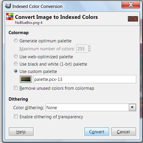
Whenever you save a faction .pcx, first Image>Mode>Indexed and in the Indexed Color
Conversion pop-up, click Use custom palette, uncheck Remove unused colors from color map,
and click on the colorbox under Use custom palette to load your palette file. Hit
Convert, then save the .pcx as you normally would.
I’ll go into this GIMP palette issue and the workarounds in more detail in future
tutorials.
![]()
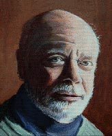
Processing a
photo headshot into a painted-looking leaderhead
[Another brand spankin' new entry posted
ahead of a lot of material. Order is restored here.]
Some programs have automatic functions for turning photos into paintings - GIMP has
oilify, which I don't think is very good. Nothing, at any rate, substitutes for just
rolling up your sleeves and doing it yourself, with your human judgment and an artist's
eye. The SMAC(X) leaderheads all originated as paintings, and your eye catches that,
even if you don't realize it consciously. So your leaderhead needs to look like a
painting. Here's how I do it.
Rainbow Lizard had a leaderhead that didn't take to the SMAC palette well, and asked me to
look into it. He supplied the original photo:
(Pay attention to the settings showing in the pictures after this; they mostly tell you how,
while my comments will tend to focus on the equally important why.)
Nothing intrinsically wrong with it; it looks like a leaderhead. But the color level
is low, as is the contrast, and the highlights too white, matching the background.
So that background's gotta go - first thing I did was add a transparent background layer-
-Start erasing the edge next to the spot -on the shoulder- I could tell was going to be
most troublesome about wanting to select along with the background-
-Only to discover that those white highlights matched the background way too well for the
Fuzzy Select Tool. I gave up and used the Color Select Tool, after some trial and
error, at the default setting-
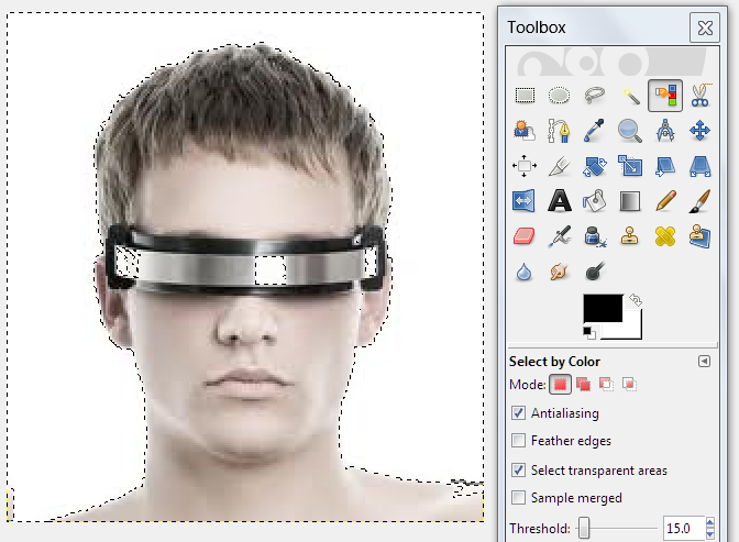
-and then prepared to begin eliminating all the white inside the figure's borders with the
Fuzzy Select Tool (Note the red-block mode setting in the Toolbox. That's Subtract
from the current selection)-
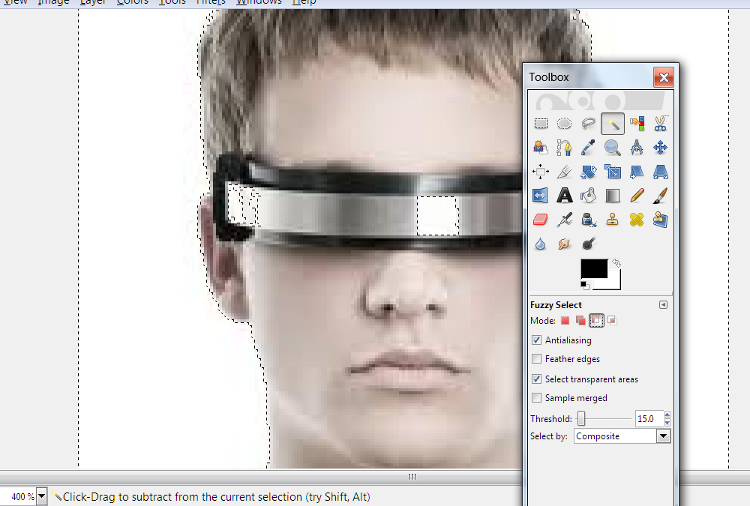
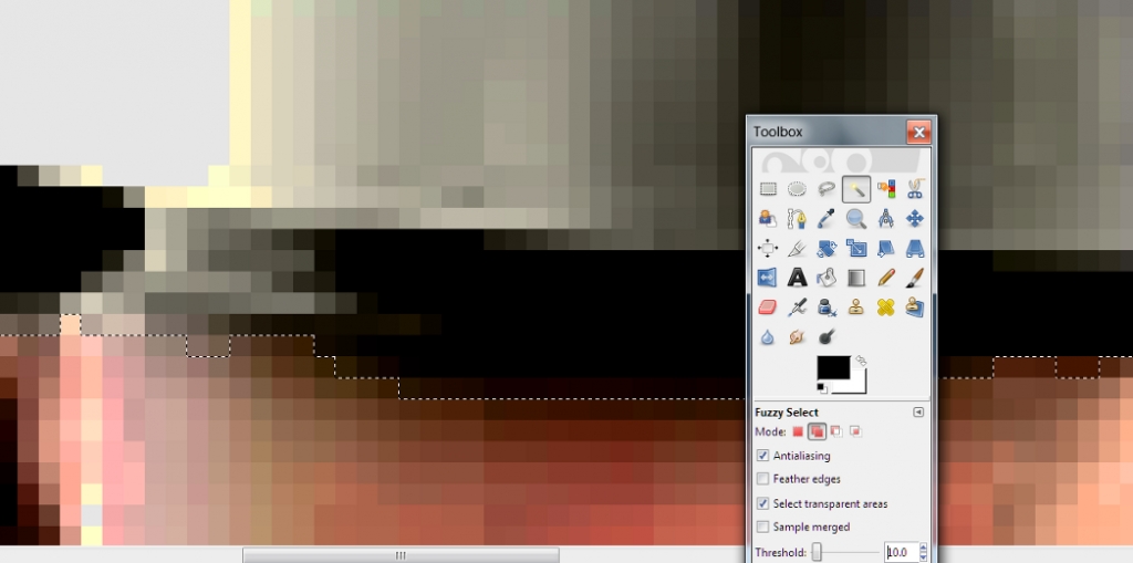
After a few minutes of zooming in and out and deselecting the easy bits on the visor at
various Threshold levels -sometimes it would jump to deselect some background, and I would
have to [Ctrl]z to back up and try again at a lower threshold- I got all but a bit on the
shoulder and neck -
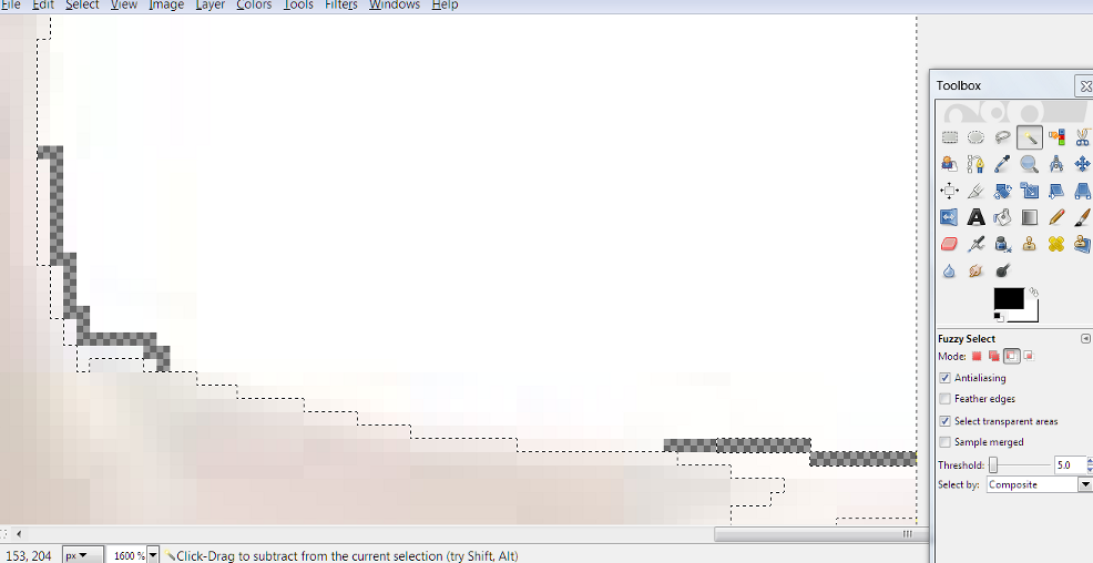
-and did a little more erasing (always have Hard Edge checked when erasing for this kind
of thing) and deselecting the rest of the non-background was easy at a low Threshold of
5.0. and that erased border-
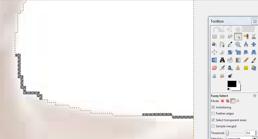
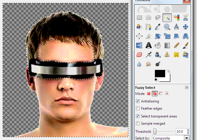
-So I hit [Delete] and started processing - and it's easier to adjust with no background
to either require more selection of just the skin, or turning wierd while you alter the
figure's colors, brightness, etc., if you don't select and leave it out.
Sometimes you like the background and want to keep it, and doing something like this
to allow you to paste the figure back over it is called for, instead of in this case,
where the background was in the way.
The thing is, photographs are just higher resolution than most paintings. They
contain more detail and more colors; not as many as reality, but a lot more than the
average painting. The eye picks up on the differance, even if you don't
realise. Remembering that is the key to what we're going to do here
First, fiddling with the Brightness/Contast; the image needed serious darkening, and
higher contrast brings up detail and the color levels, too. They also balance each
other out somewhat.
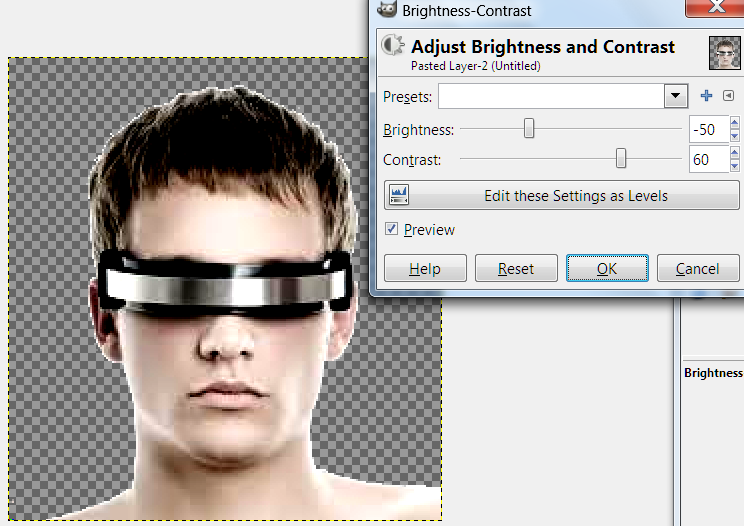
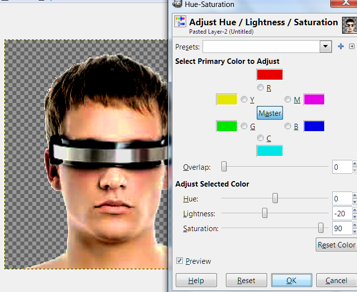
And then I brought the Color Saturation up more directly. This also brightened
things more in a different way, and I darkened a little more to compensate.
Everything in this process is partly balancing dark and bright, and all
processing/fiddling/altering, done right, results in the right kind of careful
artificiality that says painting to the eye. It was a little too red, so a minor
hue-shift, to a hair yellower, too.
Next, I wanted to do something that would mess up the colors of the hair and visor, so I
needed to select everything but them:
This involves a lot of zooming in and out, selecting and deselecting at different
Thresholds, which is typical for the Fuzzy Select - a very useful tool, but aggravating.
Now here's the thing; human skin contains a lot more colors finely distributed, if you
look closely enough, than anyone can manage in artwork, which is why it's so difficult to
come up with realistic skin tones when you're going for realism. Real skin has blues
and even greens in it - we're going to reduce those in favor of more of the reds and
yellows artists use.
That brought up the color levels 60%, so to compensate-
The shot before last, note the big bit of pink lined by lemon yellow in that problem area
on the shoulder. There's more up the edge of the neck and cheek, so to fix it:
Then I expanded the select to get all that lemon yellow around it and did something
simular - in this case, hue-shifting back towards red a little, darkening a little,
reducing the color saturation a little more - all of which browns both somewhat. (Browns
are more-or-less dingy, dim, orange in computer colors.
Usually, in processing a leaderhead, I'd have done a lot of selective blurring of very
fine details with the Smudge Tool on very low power, but this leaderhead is a younger
person than most faction leader images, with much more smooth skin than usual in a photo
that was low on that sort of detail, too. There's a trade-off; no time
smoothing/simplifying facial lines and fine speckling typical of photo headshots, but the
lack of those details is precisely why it adapted so poorly to the SMAC(X) palette -
nothing to break up the color patterns, which looked bad.
So, as I said, real skin is higher-resolution than painted, and has a LOT more
colors. Next, I simply change the mode of the image (literally
Image>Mode>Indexed) to a lot less colors:
I change it back to RGB, so I can change the mode BACK to Indexed -- I'm hoping that now,
it will take to the SMAC(X) palette, which has twice as many colors:
-But no. That's a little better than the problematic problematic attempt I'm
demonsrtating how to fix, but still not good enough. I [Ctrl]z to back up a step,
something you do a lot making graphics, and use that Smudge Tool to smear together COLORS
where they are in thick bands and the areas I've learned are going to convert badly.
It's too idiosycratic to be worth trying to show.
Next, I do a little sharpening (Filters>Enhance>Sharpen) at around 30% and blurring
(Filters>Blur>Blur) and sharpening and blurring, more sharpening - I'm not sure, but
this has always been part of the process, and I think it works because low-level
sharpening accumulates interuptions of those strange-looking color bands/patterns, and
blurring every third or forth time keeps it from getting too pixelated-looking. What
I'm sure of is that it often makes a big difference in this painting thing. It's
another part you have to use that human judgment and artist's eye, and not something easy
to/worth trying to show.
Then a little more selective smearing together of color patches and unwanted detail the
sharpening put in with the Smudge Tool, still set to 10%, 20% at most.
One secret to helping when your work doesn't want to convert to the SMAC(X) palette well,
is that sometimes, it will do better if you do the scan lines and THEN convert; the
alternating contrast lines can break up those color bands/patterns, or form intermingled,
alternating patterns that cancel out.
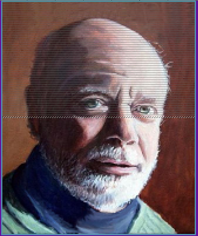
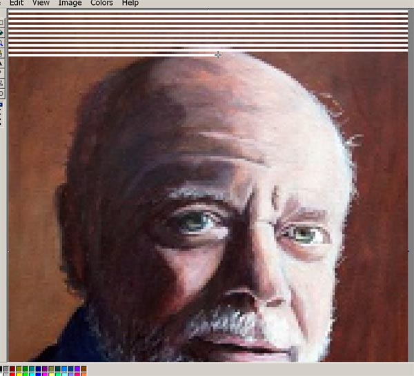
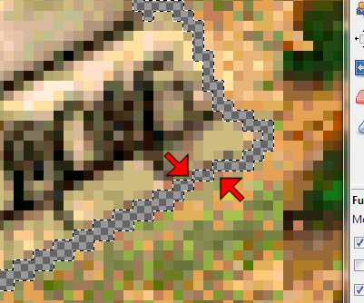
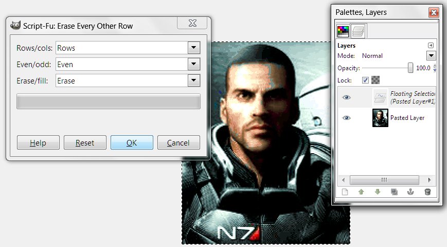
I've described the scan-line part before a number of times, but briefly: select the
entire image ([Ctrl]a, [Ctrl]c to copy, Colors>Brightness-Contrast>contrast +15-20,
[Ctrl]v to paste back the copy, Colors>Brightness-Contrast>contrast -15-20,
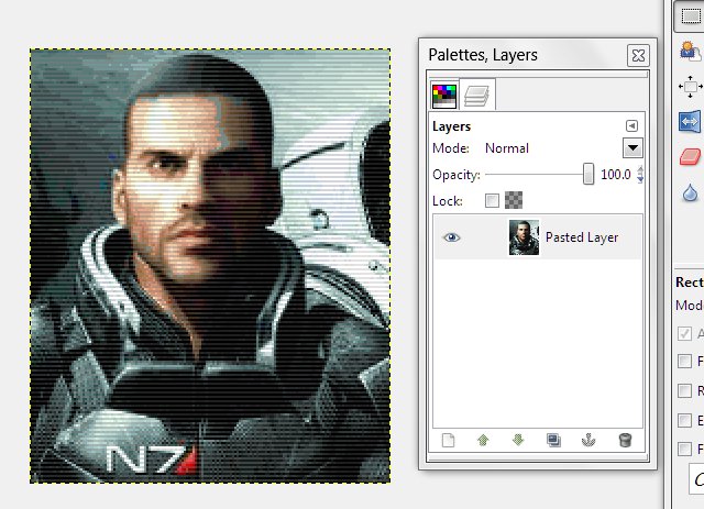
Filters>Distorts>Erase Every Other Row> deselect. Scanlined.
For a background, I pasted it over a Matrix thingy, as I did with my own hacker-type
faction. This is the original size of the image, but cropped to the exact
porportions of a leaderhead, only a little larger:
However, the youthful look of the leaderhead, the videogame look of the logo and bases for
the faction, and the attitude displayed in the leader quote in the .txt file suggests that
a background consistant with youth doing as they please, such as a bright video game sorta
background, like he had a game paused on the big screen behind him while he spoke on the
comm, would be a better fit for this leaderhead. It would also fit that the figure
was obviously backlit to stand in front of something very bright.
Rainbow, see if these instructions are enough for you to do something with the picture -
I'd rather make sure I'd empowered you to do it for yourself than just give you a file
already processed. Teach a man to fish, and all that.
![]()
Bases
[This goes after "We
interrupt our irregularly-scheduled program for this bulletin-". I've
posted a few later ones out of order, recently. As always, these older entries in
the series discuss some outdated technique, but also talk a lot about the why and the
thinking process, which is eternal, and at least as important. It's the difference
between hackwork and art.]
I’ve decided to change my format from talking about my working process on a faction I
finished over six weeks ago to talking about what I’m doing now. I can go into more-
and more educational- detail that way.
(Yesterday in the Beta Lyrae thread, Darsnan and I were discussing the possibility of
changing the bases for his alt. Usurpers/Imperial Starlost Progenitors. I give these
remarks about context of the work because the best game art doesn’t just look cool-
it tells a story. These things have an important effect on the art decisions you make.)
The Starlost- my label, not his- were a naval survey expedition that was lost in space
long before the Manifold disaster destroyed Prog civilization, or the schism between
Caretakers and Usurpers. After many thousands of years in stasis, they ended up stranded
on Beta Lyrea not long before the humans, and instantly came into conflict with the
Autochthon- descendants of later Progenitors who were stranded there while the Starlost
were in stasis and survived the Sentinels by achieving harmony with the environment. A lot
of art decisions went to trying to suggest that the Autochthon are Progs gone native, and
keeping a look consistent with their story.
(The Autochton  are alternate Caretakers
 ![]() , part of my project, mostly in
collaboration with Darsnan, to make alternate/splinters of the official factions. I cannot
express how amusing I found it to put the aliens in log cabins.)
, part of my project, mostly in
collaboration with Darsnan, to make alternate/splinters of the official factions. I cannot
express how amusing I found it to put the aliens in log cabins.)
The Starlost want to create the infrastructure to build a starship and leave. I’ve
gone for a look that says “Alien Captain Kirk down on his luck” with the art-
(From this  to
to  this
. He has more scars, some of his tusks are broken and his armor is a little torn up, but
somehow with the new color scheme, he looks less evil and more tired. The trimmed/capped
rill horns help too, though that's largely a practical consideration for a starship
crew...) thus the approach I took to the diplomacy landscape shot, changing the DL Darsnan
pointed me at- of a ship in flight- to the ship grounded and very chewed up-looking.
this
. He has more scars, some of his tusks are broken and his armor is a little torn up, but
somehow with the new color scheme, he looks less evil and more tired. The trimmed/capped
rill horns help too, though that's largely a practical consideration for a starship
crew...) thus the approach I took to the diplomacy landscape shot, changing the DL Darsnan
pointed me at- of a ship in flight- to the ship grounded and very chewed up-looking.
 Usurper DL
 Gebazzu DL
 Starlost DL
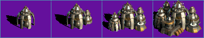
With the bases, Darsnan liked my suggestion of running elements of Usurpers and Caretaker
base designs together to suggest that these guys are from before the schism.
+![]()
___________________________________________________
So last night, I did a little cut and paste work to put the top of Caretaker bases over
Usurper ones. I did some minor fiddling with the Usurper struts to splay them just
slightly and make them look a tiny bit more like Caretaker ones. I finished by trimming
down a Caretaker subsidiary building to paste at the top of all the Usurper elements as a
dome-cap.
This morning, Darsnan approved the design I posted last night, and picked one of the color
schemes I'd done. We’d agreed on faction color and customizing changes to the Usurper
logo colors, so I was ready to begin actual assembly of the graphic.)
I opened the Usurper .pcx, and copy/pasted the whole thing into MS Paint. I scan lined the
diplomacy landscape I’d gotten approved and pasted into the Paint copy.
Now it was time to put in the bases. I opened the .pcx I’d saved before I made .jpegs
to post last night- of the version of the bases Darsnan chose- I’d just done the
first row of bases, and saved a copy of only that. I copy/pasted it over the Usurper bases
in Paint- my design covers the originals completely, so I did it with Draw Opaque off. I
did the same with the next two rows, leaving a bit of the shields showing behind- which
will make it easier to get the surround when I get to replacing the rest.
When I got to the first row of water bases, I had a decision to make. Some bases look okay
unaltered floating; I decided these stilted ones would not. I pasted them in, which left
them on top of Usurper platforms -which are pretty generic- they’re brown, though. I
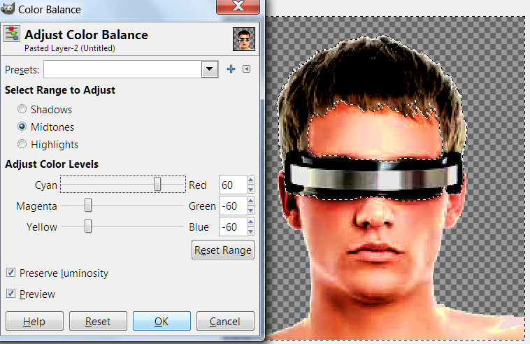
copy/pasted that row of bases back into The Usurper file in Photoshop, switched the mode
to RGB (Image>Mode>RGB Color) to get access to advanced functions, and sampled the
dark brown of the platforms. Then Select>Color Range… I set the fuzziness (how
close to the color sampled it needs to stay in selecting inside the select box around the
row) to 60% -somewhat exclusive and hit okay. Sometimes it takes some trial and error to
get exactly what you want selected- this looked about right, with most, but not all, of
the water platforms selected- the darkest parts.
Image>Adjust>Color Balance, and I was bringing up the blue and cyan to 100%, with a
touch of green, (about 20% was all that didn’t make it TOO green), resulting in a
dark, slightly greenish blue that matched the blue parts of the bases proper, but left the
platforms looking like separate pieces. I fiddled a little with the lighter-brown bits
left over with an eye towards matching them with the pale-gold highlights of the bases,
but they didn’t want to select cleanly, and I decided the platforms looked good the
way they already were. I then copy/pasted the row three times into the Paint copy over the
Usurper water bases. Now, all that was left was to put the shields back.
In Photoshop, I opened shields.pcx- a file I made long ago of both official
sorts of bare shields (and a few I invented) for just such a purpose. I pasted the
Progenitor shields into a third copy of MS Paint (the leaderhead is waiting in another,
but I’ve already covered that part of the process) to erase the back halves.
It’s another thing that’s easier to do in Paint.
I did so with the smallest stage-one shield and copy/pasted over the smallest shielded
water base zoomed in at 800%- still with Draw Opaque off, so it only superimposed the
shield over the base. I saw that the shield was far wider than the remnants around the
back, so I found the pip on one edge of the select box and narrowed it. I tried to match
the edges of the front with the back that was already there, narrowed again, and got a
nice match. I repeated the process with the next size, taking a few seconds to draw in a
gap on the left with the color sample and line tools. When I’d same the same with
stage 3, and tried to scroll over to the next size shield, I discovered I’d
accidentally skipped the smallest sized, making extra work for myself. Oh well. I pasted
the largest size -it fit this time-, needing only a few pixels drawn in on the left, as
the building covered the rest.
I zoomed out a little and selected the upper parts of the row of water bases I’d just
shielded -the upper parts are identical to the land bases, so this way is less work- and
copy/pasted them (w/shields) over the stage-one-shield land-base row. Correction: I wanted
to do it that way, but concluded that the shields sat too low in front to leave all of the
water elements out of the select. Instead, I repeated the process one base at a time. Oh
well- I think it’s instructive to leave my missteps in the narrative. I was able to
select enough of the water row and copy/paste first to avoid having to draw any gaps in
twice. Without the drawing and resizing, it took only a minute to finish the land row.
(Then I pasted the Paint master copy back into the Photoshop Usurper .pcx and saved it in
an in-progress folder while I went to run a quick errand. Artists, you want to be in the
habit of saving your progress often. Stuff happens.)
When I got back to work, repeating the process for the stage-two Tachyon shields went much
more smoothly without the wasted time resizing- and because I did it on the land bases
first and thus could copy/paste the entire row on top of the water bases smoothly.
With the bases done, it’s now time to post this and get to work on the logos…
![]()
Logos
[Describing, for the most part, how I did it
in Photoshop5 - but other high-end graphic editors shouldn't prove very different.]
…Now this part is short to describe, but time-consuming and tedious in practice.
We’d agreed to go with the Usurpers logo for the Starlost- but with the red parts
turned blue, to match the change in the leader portrait’s shoulder-armor and the new
faction colors.
There are a lot of ways to do that- the best one I’ve found for varied shades like
the logos sport involves a long time zoomed in close with the Magic Wand (fuzzy Select)
tool, adding all the red bits of each of five iterations of the logo. It took a lot of
time and nit-picking concentration; somewhere close to an hour, I’d guess. Once I had
everything selected, hue-shifting the red (and a little orange) to a royal blue
didn’t take long. I’d considered using the color balance function instead, but
tried the hue-shift first, (each has some benefits over the other, but a hue-shift is
usually simpler) and found the result attractive.
However, I found that the yellow parts of the logos could maybe stand to be yellower, so I
spent another 10 minutes or so selecting those parts of the logos- they gave me less
trouble than the red parts selecting, not least because it was for an intensifying, not an
outright color change, so it was less important if I missed the odd pixel.
This time I did use the Color Balance function (Image>Adjust>Color Balance, as
opposed to Image> Adjust>Hue/Saturation-[in GIMP, the same functions are found under
the Colors menu instead]). I shifted the yellow/blue slider all the way over to yellow. It
didn’t make a huge difference, but I thought the logos looked great now. The yellow
bit in the center of the Usurper logo clearly was supposed to be a star, something
I’d never noticed with the orange parts surrounding it. Against shades of blue,
however, it stands out as a star, and looks perfect for the symbol of an stellar
exploratory expedition.
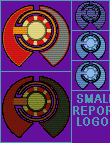
The only thing left to do now to complete the graphic was to make my standard changes to
the Small Report Logos. I used the sample color and pencil tools in Paint to draw it in by
hand. With other logos, especially original ones I made, I sometimes shrink the other
logos to fit, but here, adding some color by hand to the pre-existing SRLs seemed best. I
sampled the predominant shade of each section of the logo and added it by pencil until I
was happy with how it looked.
I selected the result and pasted it into the blank pcx I’d used for scan lining the
portrait and diplomacy landscape. I selected the box the logo was in, sampled the
transparent background color of the .pcx and reduced the contrast of the logo 50%. This
darkened the logo, but also changed the color of the background enough to ruin the
transparency, so I switched foreground and background colors to save the original color
I’d need in a second, sampled the new background color, clicked Select>Color Range
and set the slider to zero before hitting okay. This caused it to select only the exact
shade that I’d sampled- the darkened background and nothing of the logo. Then I
clicked Edit>Fill, and with it set to use Background Color at Threshold mode with
opacity at 100% I hit okay, which filled the selection with the original,
transparent-in-the-game, background color.
I carefully selected the logo- except the bottom row of pixels- and pasted it back in the
right place in the master copy in Paint, set one pixel lower in the box than the other
two. Doing this with the middle, mouse-over, logo causes it to seem to leap slightly
forward in-game when your pointer passes over it. I think it’s a neat effect, and I
do it in all my faction graphics.
Having already changed the faction colors and dropped in the new leader portrait, the
graphic was now done. All that was left was to “sign” it and post. When done
with the credits I always add to left over space in the graphic, I copy/pasted the master
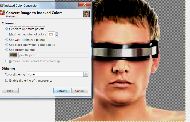
image back into Photoshop, Image>Mode>Indexed Color, loaded the SMACX palette to be
sure all the colors were kosher with the game, and seeing no problems with the result,
saved, zipped it up, and posted for Darsnan.
Next up: (maybe) Why you should sign your work, IMO.
![]()
His and Her Nerds
So I needed a new leader for my alternate/splinter Data Angels. After I collaborated to
varying degrees with Darsnan on graphics for splinter factions he’d created for his
Eye of the Believer scenario, I kept going to make a complete set of alternates to all the
official factions. The alt. Data Angels were the 14th, and would complete the project.
(Actually I’d already done more than one alternate for some of the factions- if I
include overhauls I did of someone else’s custom factions, the Cannabis League and
Mindworms with Minds, I’d done the Gaians four times. [Then if you include the
alt. Gender leaders project - well, I once played a novelty sp game with four Gaian
variants and three Planet Cult that I called "Attack of the Eco-clones".])
So over a month ago [years now], I solicited ideas for the alt. Angels in the
“Alternate Official Factions in Progress” thread. Sexymindwworm said
“Microsoft”, Psyringe said “nerd”, and I said “Japanese”.
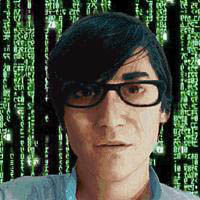
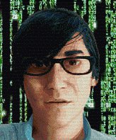
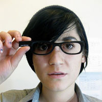
Thursday or Friday night, I googled for pictures of Japanese nerds. I was surprised not to
find a lot more than I did - it was really slim pickin's. I saved a few nerd photos- you
never know when you might have use for the images you don't use now, later - and loaded my
favorite into Photoshop to begin working it over. The nerd was holding up a computer chip,
and since it was hard to make out, I decided to take the hand and chip alike out of the
picture.

Before I began working on that, it began to dawn on me that there was a problem. The big
chin had fooled me in the thumbnail - this wasn't a very young guy, it was a woman. And a
subtly good-looking one when you looked close, at that. See the before and after shots
later on.
I pasted the picture into MS Paint, because the first step of turning her into a man would
be some copy/paste work to alter the proportions of her face- and as I’ve said
before, I find Paint easier to use for copy/paste work than Photoshop5 or Photoshop CS,
though these days I use GIMP. I started by zooming in very close and selecting a box that
took in most of her chin, and copied it. Then I pasted it back in moved down by one pixel.
Then I did it again. Pasting twice moved one pixel each time instead of once moved two
pixels keeps the edges of the box-of-face you’re pasting in from showing much as the
shading of the face changes along its contours. Then I selected a bigger box that took a
bit more of the chin in both directions- you don’t want to paste in the same edges
too many times, or it makes a funny pattern- and did it again. The photo was nearly twice
the dimensions of the portrait I was working towards, so this wasn’t a big change,
but enough to make a prominent chin moreso.
I did the same sort of thing with her jaw line, moving it outward to make the face bigger.
Likewise for lengthening her nose. Raised the peaks of the cheeks up and out- Japanese as
well as male, remember. It looked like a dude with plucked eyebrows and light makeup now-
but- I saw what it still needed then. I proceeded to widen his neck.
So after- I dunno, maybe an hour or two of this; it’s hard to keep track of time when
you’re deep in right-brain concentration- I copy/pasted the whole shot back into
Photoshop and began using the smudge tool to erase the hand and chip.
There’s a million things I did in the next couple of hours that I could show you if
you were in the room with me, but can’t describe in any reasonable length - the
process is too intuitive. I smoothed out suspicious irregularities/regularities I'd
created around the edges of all the copy/pasting. I squared those tapered eyebrows
and changed the shape of the eyes, removing all the mascara and eyeliner that didn’t
stand out a lot, but definitely looked female- all with the smudge tool. I wasted a lot of
time trying to select the upper lip and lower face with the magic wand- some things select
easy, and others refuse to select just what you want no matter the sensitivity settings,
and this was one of the latter. I eventually got something in the right neighborhood
selected after far too long trying, and reduced the color saturation and brightness just a
tad to make a (bad) five o’clock shadow. (Which, alas, later vanished anyway between
the effects of processing the color to make it look painted and the limitations of the
SMAC(X) palette, which is not kind to subtle shading.)
His lips were a bit too full and too pink to look male- I selected the lips and reduced
the color level a bit, then narrowed them with the smudge tool. I did a lot of things to
make him look male and Japanese, far too many to describe in full- if you have talent, you
should be able to figure it out like I did. I can’t really draw, and have to depend
on nit-picking patience and perfectionism to compensate.
I gave him a haircut- the hair was too full in back where it peaked around the neck, and
shortening it there looked more masculine; same for making the hair on top less poofy. I
left the long, full, bangs, though, because they looked nerdy.
An easy thing I did towards the end was to make his shirt look a little future-y. I did
something I do a lot- removed the lapels from his collars. They stuck up straight now, and
no one but me may notice, but the devil is in the details in these things.
It was time to make it look like a SMAC-style painting now. I pasted the shot into GIMP to
use Filters>Artisitic>Oilify on very low settings - high settings, even medium, turn
your image way too impressionistic. Then I pasted back into Photoshop and spent a long
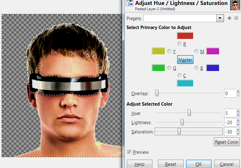
time fiddling with hue/saturation and color balance. It’s another intuitive thing
impossible to describe in detail, but the idea is to end up with a narrower range of
colors than a photograph. With the color balance function, I generally brought up the red,
magenta and yellow at the expense of the blues, greens and cyans- real human skin has a
trace of those tints, and paintings tend not to. I kept bringing up those rosy orangey
colors, then reducing the color saturation to compensate. There was a good deal of
fiddling with the brightness and contrast, too. Also blurring and sharpening to blend my
mistakes rearranging in, and carefully reduce the realism further.
Finally, I loaded the SMAC palette- this is one of the only times you’ll like the
limitations of the 256-color palette -when the image takes to it well, anyway- because it
reduces the range of shades of the skin, making it look even more like a painting. The
result was a face that was a little blotchy-skinned- which is ordinarily a lot of work to
smooth out, but perfect for a nerd. All the processing had turned the highlights of his
hair faintly red, so I selected his hair and turned it back to blue.
The faint background was long wiped out by now, so I selected it, deleted it to the white
background color and went looking for a new background to paste the figure onto. The
hacker theme made me think of the green on black Matrix thing, which I had no trouble
googling. I pasted the figure onto that- and hey! The numbers of the shot I found were
Japanese. Perfect. (That background ended up giving me the color scheme I used for the
rest of the elements of the faction later- green and black.)
[I believe I blurred and sharpened the whole once or twice, too, to blend them together a
bit. The alternative is a lot of time zoomed in very close with the Smudge tool
scaled small at low power, working around the edge of the pasted-figure. (Anyone
who's ever spent much time shooping any photos will have noticed that the edges of people
in photographs blend in with their background, or it would be a heckuva a lot easier to
make convincing slanderous fakes of Sarah Palin.) I probably spent a few minutes
going around his edge with the Smudge tool, but I don't remember adding the excellently
faint greenish tones near his edges, and that looks to be a happy accident of
blur/sharpening.]
So I added scan lines and dropped the portrait in, then saved and went to bed.
… the next morning when I looked at it, I decided that his jaw was too robust to look
really Japanese, so I ended up spending a while with a pre-scan lined copy I’d saved
(always save a .bmp or .png before you do the scan lines- you end up needing to revisit
the portrait for further alterations or something often enough that you’ll be glad
you did) and spent some time slimming his jaw and making his chin more pointed. Now he
looked reasonably Japanese. I re-scan lined and dropped him in again…
Voil�! The leader of Node Masters - he was project manager on the Network Nodes for
MorganSoft before he struck out on his own; he left a backdoor in each one...
...
Not long after, as part of a collaboration with Maniac on fixing up the suckier SMAniaC (I
tried to talk him into changing it to SManiAC for symmetry and the AC ending, but no dice)
factions, I used the original shot again for a SMAniaC faction (The Genesis, replacing a
pasty-white creepy mutate), leaving her caucasian and a her this time. Perhaps
the difference in process will be educational.
[More than I regret my fuzzy memories of my process on a job I did three years ago, is now
that I'm tarting up an old tutorial with pictures, I find that I saved so few pictures of
the stages he went through. Fortunately, I have a little more of the female
version.]

As you can see, she went through very simular, opposite, steps. I thinned her
jaw line and made her chin less prominent - and took out the cleft. I made
her hair fuller on top and longer in back, though I kept the unruly
bangs untouched again - they're still nerdy. In fact, I deliberately added unruly
escaped hairs around the edge of her hair, since the fluffing up had smoothed things out;
it's perfect for a non-vain busy lab wonk. (ProTip: When it comes to straight up
redrawing elements of a portrait, hair is easy, at least with the handy-dandy Smudge
Tool.)
I tapered the shape of her glasses frames; it's a subtle cue, but squareness of the
originals was one of the things that looked superficially male and fooled me until I
took a good look. I gave her a nose job. I turned her shirt into a lab coat.
I am proud to say that I reckon I made her noticeably better-looking without making her too
good-looking. She still belongs in a genetics lab, but has just enough of that
sexy librarian thing going that grows on you until you'd totally like to make out with her
if she'd let you.
Maniac's reaction was "I love Dr. Nerdinia!" (my nickname for her.) He just
meant that she's a good character image - I think.
...
[Amusingly, only as I edit this together do I realize that the original was wearing a
cloth headband, strangely-placed toboggan, or a snood, of which more is left, when you
look for it, on him than her. If my eyes worked, I'd be a very
dangerous artist, but the much sharper monitor I have now helps. I don't
think I ever spotted the nose ring before, either, but it's completely gone, anyway, for
both of them.]
Neither leader stands out in my memory as being especially a lot of work, as leaderheads
go, and people could play the two together with little more reaction than thinking they
must be related - which ought to be a good characterization/background/story point.
(Not the only portrait I've used on more than one faction - I could easily play
another novelty game called plain "Attack of the Clones" with no hippies or
completely identical leaders.)
Below's the line-up, original alongside both final versions. They're a good example
of the universe of possibilities you have for taking source material in many directions if
you're good and think.
![]()
AC Palette
If you're going to mod SMAC(X) graphics, eventually you'll run into the "blue (or
pink) box around my bases" problem...
Do this. Load palette.pcx. That's the color guide the game uses. Save it as a palette your
graphics program can use. In Photoshop5, that's done through Image>Mode>Color Table.
Choose the Save option on the right of the pop-up. In the pull-down beside Save As, choose
Microsoft Palette (*.PAL) and save.
To create a GIMP AC palette; open palette .pcx from your SMAC(X) root directory (any
untouched faction.pcx should do, but with this one you can feel sure).
Windows>Dockable Dialogues>Palettes. Right-click on the background of the
Palette box>Import Palette. Check the Image option at the top>Import.
You should now have a palette called something like palette.pcx at or near the top of the
Palette box.
Whenever you save a faction .pcx, first Image>Mode>Indexed and in the Indexed Color
Conversion pop-up, click Use custom palette, uncheck Remove unused colors from color map,
and click on the colorbox under Use custom palette to load your palette file. Hit
Convert, then save the .pcx as you normally would.
Load that palette always before you save your work- some color manipulation alters the
default palette, and stuff doesn't always display the same in-game. Doing this can head
off a lot of problems.
By the way
The sun in Alpha Centauri is always to the right at a
late-afternoon angle.
Remember this when you're lighting your bases- they WILL look subtly wrong if you get them
turned the wrong way. I have seen others do this with otherwise excellent bases. Do not
flip my nice Deadlock bases horizontally, and then credit me like it was MY
fault.
(Do not forget to credit me when you steal adapt my stuff, either. I don't mind being
ripped off- I’ve done it to others in the past, but I did credit them.)
Signing your
work
It was very hard work you did; take pride, man, and take credit.
What I'm talking about is putting some text into the empty spaces of the .pcx files
claiming responsibility. Network Node often did this. I always do it.
Why?
Because I'm proud of my work. I can't speak for you, but I often don't bother to have a
look at any text files included with other people's art, and you ought to make it easy for
me and others.
So why should you do it?
Because I might rip you off for one of my projects. Not wholesale; but for instance,
Darsnan has designed several faction graphics by telling me to take the bases from Network
Node faction Y and the logo from faction X, and- you get the idea. We all poach from each
other all the time, (that's just the way fan creative endeavors are) and it's a good idea
to stick your handle in every file you've worked on that you can. (DO be aware that
not everyone shares my relaxed attitude about stealing repurposing, and respect
the wishes of those who don't want to be robbed, should you become aware of them.)
Try to give credit when you rip me someone off. It's cool; I'll credit you when I
poach from your work. Take it as the complement that it is when your
stuff is worth stealing- but be sure to have signed it...
[All these passages were written a long time ago, when I'd recently done a few factions
that involved punching up someone else's work, and I'd been collaborating with Darsan,
doing it the way described above once or twice. I stand behind my remarks, but
haven't adapted another SMACer's art in years. It's an even prouder thing to do
all-original work, especially as you get a body of work under your belt, gaining skill and
confidence. It's not a bad way at all to get started, though.]
A
thought on cropping leaderheads
When you have any choice- the shot you're working with is a different shape than you need,
for instance, or when the diplomacy sizing comes out a pixel wider & taller- about the
positioning of the leader's face, I'd suggest going for whatever tend to center the
leader's eyes in the box. Sometimes there's a reason not to do so, but basically it's a
video conference, and we're assuming they've got something better than a webcam over their
monitor.
The leaderhead, ideally, is looking straight at the player in most cases. Get those eyes
as close to the center of the box as possible.
Network Node
Factions
I've mentioned poaching from Network Node's work. Network Node was a SMACer and an
associated website that is now defunct. There was an amazing quantity of custom factions
there, many if not the majority, I gather, by NN himself. It's a wonderful source of
material to poach from. For me, not least because I don't feel as comfortable with
generating bases from scratch as most of the other elements.
Maniac, who isn't completely helpless with a graphics program but is no artist, patched
together several of the original faction graphics for SMAniaC from NN factions and used
others wholesale (later, I came along and made him the replacements and improvements used
in the latest release, but his patchwork creations were quite servicable.)
I’ve posted a giant .zip of all the NN factions -originally provided by Maniac- in
our Downloads: http://alphacentauri2.info/index.php?action=downloads;sa=view;down=102
No faction artist should be without it.
Ready-made
projects for the faction artist...
Are you an artist in need of a project? Go to Apolyton and search the AC archives - there
were about 10 million custom factions posted in the old days, most of them without
graphics. In fact, if you're like me, you've downloaded a few custom factions from various
sites' Download section only to find them artless, or with an existing faction's art, or
graphics half-customized, but with Hive bases.
Well, make some of those poor things some proper full faction graphics. (That's how I came
to do the Texas faction art to be found on my factions page.) It'll keep you as busy
as you want to be for quite a long while...
Managing all
your files
If you're like me, you're going to end up with a god-awful pile of files related to
graphics projects- other peoples' factions you've downloaded, pictures you've used or
thought you might use, your finished faction graphics, .zips of your finished graphics,
saves of crucial stages in something you worked on- stuff like that.
In one of my SMAC(X) directory copies, I have it mainly divided into three sub
folders I created: Factions, Web page, and Graphics. I dump factions by people I don't
know in the Factions folder, which has many sub folders. Because I maintain a web page for
my custom factions, I try to put any .zip files in one place there, (and also any
thumbnails and screen shots for the page,) and the Graphics folder started for general
stuff in progress, and has evolved into my main workspace/storage in the SMAC(X) folder.
It has numerous sub folders, too; A lot of my work these days involves multiple factions
as a set, and increasingly I need to dump all related files somewhere together to help me
keep track. I have an AC2 subfolder for forum icons and forum-business art in
general. I have a (bulging) avatars sub; I have folders named after various people
I’ve collaborated with, where I keep stuff related to those projects. Many of
the subs have subs.
My system has evolved as I went, and I cannot urge anyone just getting into this hobby
enough to not dump stuff into the root folder like I sometimes did at first. That's where
blank.pcx.pcx and my blank shields file, shields.pcx reside to this day [writing a long
time ago] - two files I use in making almost every new faction graphic- and while I was
thinking about it, I just moved those two to Graphics where they'll be slightly easier to
find when I want them. [It’s saved a lot of time, since]
And BTW, I have another graphics-related folder: Official Factions. See, for graphics play
testing, it's quicker to replace, say, the Gaian graphic in the root folder and have a
look at an old game save. This increasingly resulted in it being a pain when I needed an
original faction for something -I’ve done a LOT of modding, and had to do a LOT of
play testing; before I did something about it, it got where I had virtually every faction
spanning three copies of SMAC(X) replaced or altered- so I finally broke down and made a
backup folder for all the official factions; the text files, too, and I get a lot of use
out of the folder and save a good deal of time having them where I know they'll be waiting
unaltered.
Your mileage may vary, and you'll want to develop a filing system that you're happy with,
but I daresay that any modder of any flavor will back me up on this: you need to keep your
modding-related files organized, or you will be sorry.
Dedicated folders are your friend.
Collaborating
I think the merits are probably highly variable according to your nature, but I recommend
getting into collaborations when you can. I’ve found that, having put so much work
into a graphic, it bothers me very much when I post one and get little or nothing in the
way of comments.
A month or so into my first SMAC forum, someone eventually told me he loved my stuff, but
generally didn’t have anything to say about it. That’s a big reason that I go to
so much trouble to engage new artists when they pop up; I know how sad and infuriating the
sound of crickets chirping in response to good work is. Believe me, I know from
extensive bitter experience. Knowing that it probably has more to do with
(especially) the text modders -and SMACers in general- just not having the visual
vocabulary to express their reactions does little to mollify your inner child.
I fell into my first collaboration when I glanced over someone’s scenario- it
featured splinter factions, but was all text. I offered to do some graphics and put a face
on it- and we were off to the races. There are a lot of things I like about working with a
partner on a project- kicking around ideas is fun- but the thing I liked best was having
someone not only take, but express, interest in my work.
The ideas discussion of the work can inspire you to is wonderful, too. Have a look at any
of the many threads in which I worked on collaborations, scattered over four AC forums,
including here at AC2 - I think it shows what a good time we're having almost every
time. The play of ideas and different perspectives is wonderful. Over
very many collaborations over years, I've only had one fail to complete because
of creative differences (Don't tell your artist how to crop portraits when you're
not an artist and he insists the difference is important.) It's grand fun when it's
working out right.
Also, I became friends with modding giants like Darsnan and Maniac through collaborating
with them.
Now, collaboration may or may not be for you. Larry Niven likes to say that in a
collaboration, both sides have to do 80% of the work. A certain amount of time has to be
devoted to reconciling your respective visions. Outright arguments can break out.
The worst part is the waiting. When you’re all fired up and wanting everything now,
no matter how great your collaborator is to work with, he’s not going to post
instantly to answer your questions or whatever. You have to live with waiting a day or
more sometimes.
There are compensations, though. -I’m just sayin’.
Logos
I see that I've only addressed logos in one specific case that isn't helpful in cases of
making something completely original.
Logos are usually the easiest part of a faction graphic, barring faction colors. All you
need is a simple symbol that looks like something at the size you need. If you know what
sort of thing you want, Google will almost never fail you; when it does, logos aren't that
hard to draw from scratch. (And I can't draw worth mentioning.)
A couple of notes, though. I feel it's important to follow the example of the originals in
having the lower report and council logos dimmer. It's just a nice effect when they light
up while mouse-overed, and you want them to match the official factions when played
together.
This is very easy to do. Reduce the contrast for the box it's in around 50%, then put the
background color back. Simple. (Watch out for isolated bits of background enclosed within
the logo, though.)
Now, making the at-rest small report logo conform to the official style is a bit more
complex. I reduce the contrast about 75% (depending on how much color that leaves), then
in Photoshop it's Image>Adjust>Color Balance, and bring up the Cyan, Green and Blue
levels 50%, then Image>Adjust> Hue/Saturation and bring the color saturation back
down 50% to compensate. If the result is a dim greenish-blue, you're probably done. If it
still has some color left, more fiddling is in order. I like the at-rest logos to pretty
much match the look of the official ones; otherwise, they're sort've a sore thumb to my
eye.
A deviation from the official style I always use (because I think it's an improvement) is
to make the bottom small report logo full color, and the middle, (mouse-over) one reduced
in contrast 50%, plus lowered a single pixel in its box. That causes it to seem to light
up and leap forward slightly when your mouse passes over it, then move back into place and
light up more when clicked on. I think it's a neat effect, myself.
Good art modding requires pedantic attention to trivial details- and I'm still learning as
I go.
Sources for
Portraits and Diplomacy Landscapes
Unless you’re a rare bird like Kilkakon, who draws well enough to generate his own
leaderheads from scratch, when you don’t have something too specific in mind, Google
Images is your friend. Google “portrait” and spend some time poking
around. Google “painting” and “portrait painting” to find a lot
of stuff that needs a lot -and I really mean a lot- less work to get SMAC(X) compatible
than a photo. I even made a good leaderhead from a black and white drawing once,
which saved me no work, but was a fun artistic exercise.
Here’s a leaderhead gold mine that I haven’t begun to exhaust: http://www.coverbrowser.com/covers/time/21
That’s a specific page (in the 40’s) of a Time magazine cover gallery - they
started with the full-color paintings in the 20s or 30s, and only switched to photos in
the 50s or 60s, I seem to recall. Some are more suitable in style than others, and
all the important people portrayed dressed like they were in the year they were in, but
it’s still a wonderful source of leaderheads.
Also look for painters’ websites. Some of them watermark everything and ruin
it, but they’re not as prone to that as photographers are, and are another good
source for images of people that need far less work to produce leaderheads in an
AC-compatible style of painting at the right level of realism.
Here is an example of the sort of things to be found on an artist’s site:
http://www.danielgreeneartist.com/portraits-public.htm
http://www.danielgreeneartist.com/portraits-private.htm
http://www.danielgreeneartist.com/auction.htm
http://www.danielgreeneartist.com/subway.htm
I’ve pretty much mined this particular site out, so go find your own painter to rob.
Likewise, architect’s sites are sometimes a good source of futuristic base and
diplomacy landscape fodder, sometimes from the same shot, sometimes you can luck out and
get something good from very different angles.
Just the diplomacy landscape shots is ease itself if you only want a generic futuristic
cityscape. Try googling “futuristic cityscape”, for instance.
Deviant Art will require wading through mountains of crappy scrawls and stuff so cute it
would turn even Kilkakon off, but also has tons and tons of wonderful stuff to repurpose,
too.
Also, don’t forget the Network Node factions and/or my Custom Factions page, and that I’m not very
proprietary as long as I’m properly credited and you’ve never done me a bad
turn. Both are important, IMO, and that's not entirely a joke.
(Now, I've talked about how important giving credit within the community is. I
honestly see no ethical problem with adapting something from a total stranger who will
never be affected at all in any way by a limited-release non-profit fan project, and see
no point in detailing what outsider I lifted my starting-point material from - and I take
my ethics seriously. It's textual poaching, according to a dissertation I once read,
and fandoms do it. Don't play about due credit within the SMAC(X) community,
though.)
There's a lot of stuff out there, so just google it, man.
Good hunting.
![]()
Cutting Bases from Screenshots
So since I'm deep into it anyway, I thought I'd take a few screenies and talk about how
how I do it and why I do it that way. Someone might benefit. Check out the red
arrows, and you'll have exact instructions for doing it in GIMP.
Screenshots from other games are one of the best sources of bases, especially if you lack
the art skills to create convincing ones from scratch. Be sure they are lit from
your right, unless you can rework the lighting, and want to go to the trouble. This
is tedious work, but anyone can make excellent bases this way.
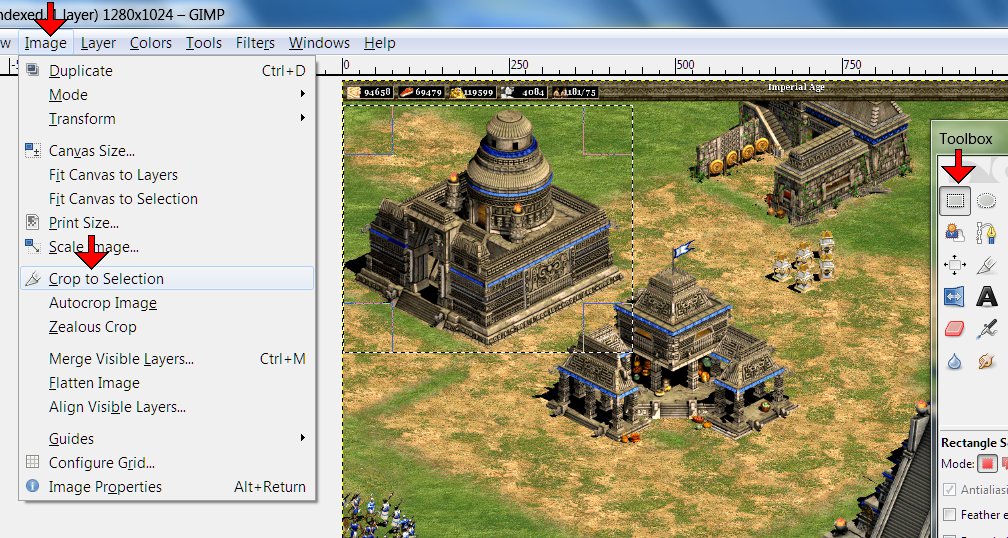
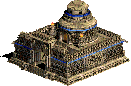
So I loaded up the screenshot and selected a box around Aztec university with Rectangle
Select Tool. Image>Crop to Selection. Easy.
I also cut the town center out of this screeny - after selecting File>Create>From
Clipboard. Save the result for working on later. Simpler than reloading the
screenshot again later. I've cut as many as five buildings from the same screenshot
when I lucked out and they were all unobstructed and workable.
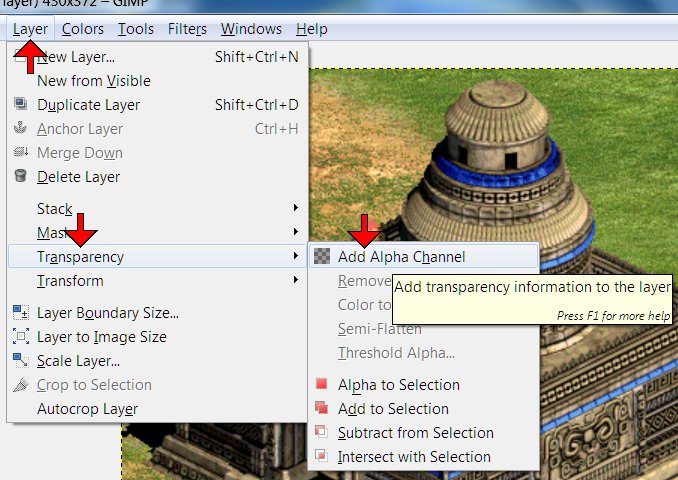
Now Layer>Transparency>Add Alpha Channel. (Incidentally, you'll want to get
rid of the ruler guides, which default on every time in my copy
of GIMP and take up space; I never, ever use them. That's View>uncheck Show
Rulers.)
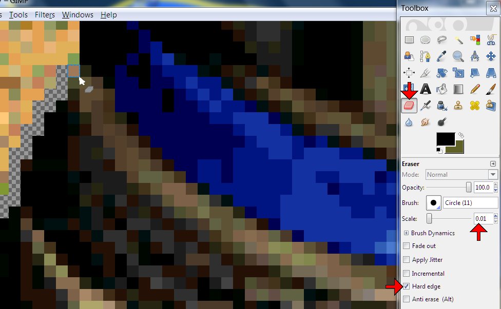
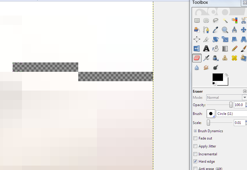
Then with the Eraser Tool scaled all the way down to one pixel and Hard edge checked, I
begin working my way around the edge of the structure. You only need a one pixel
"moat" between the edge and the rest you're getting rid of, and it saves time to
not fool with fitting anything bigger around the tight spots. Bear with me.
You'll want to zoom in and out frequently, to get a sense of what you're working with in
the bit you're on at the moment - sometimes it's easy to tell what's building and what's
not, but sometimes it's pretty tough. Note all those dingy green pixels I pointed
out. I actually had to [Ctrl]z and back up a couple of steps when I realized I'd
been chopping out part of the building.
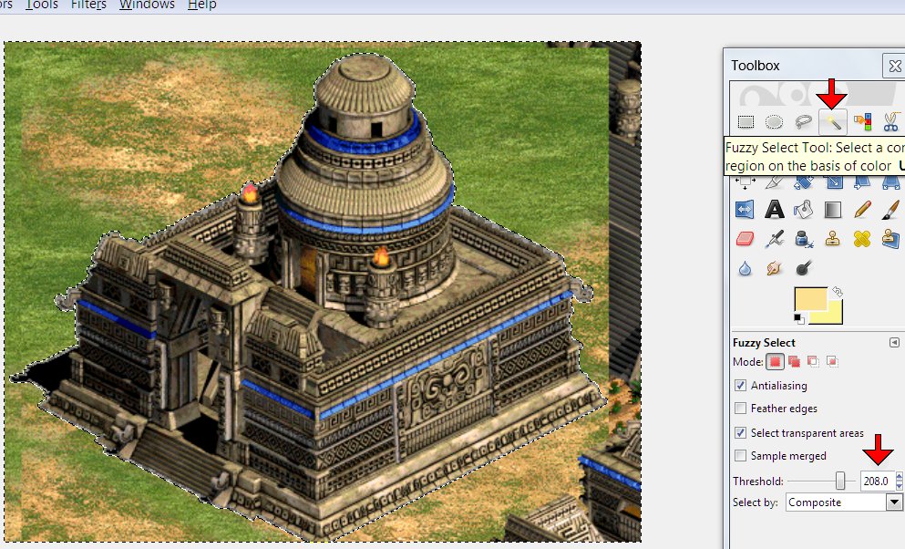
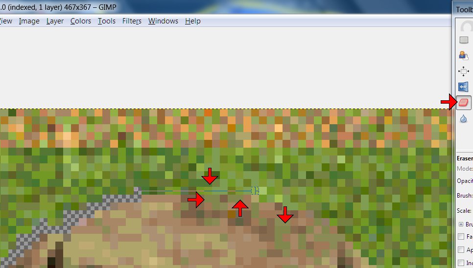
When you've gone all the way around, click Fuzzy Select Tool with Threshold cranked up to
about 200 anywhere outside the structure and transparent border. If you've done it
right, it'll look like this, and you can hit Delete...
...But if the structure selects, too, you've probably left some pixel corners touching, as
pictured above.
...
These Age of Empires II screenies all come out tall/distorted, probably because of my
widescreen monitor and AoE2 saving screenies to its own folder as .BMPs. It throws
the perspective off pretty bad sometimes.
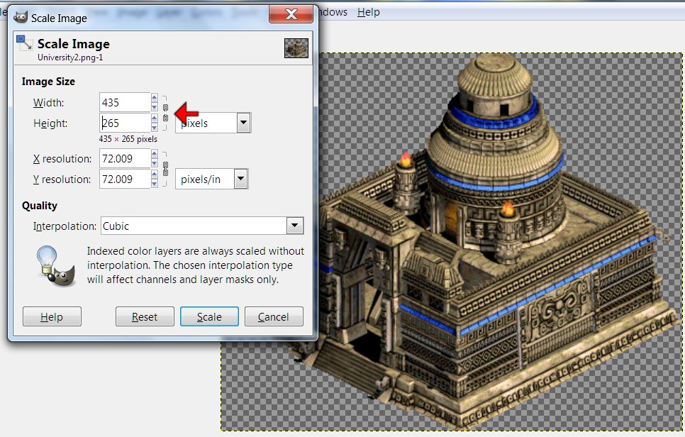
So, Image>Scale Image>unclick the proportionate dealy pictured, and figure out how
much to reduce the hight - I mostly use trial-and error, backing up and redoing it until
it looks right to me me. The result is pictured below.
Good hunting.
![]()
Scanlines in GIMP made simple, fast
& easy
Our researchers have made
a breakthrough.
Last night, I discovered a feature in GIMP that takes over half the steps out of
scanlining and turns a 10-15 minute chore into something I was able to do in 55 seconds -
I timed myself.
To illustrate the process, I worked from the version of ariete's male-led faction he
posted this morning. I selected the largest portrait, copied, File>Create>From
Clipboard (you can skip this step if you're working from the transparent-background
assembly copy, but I needed the Brightness-Contrast available in an RGB mode copy, and I
couldn't do that in a indexed .pcx without making more work for myself.) I went to the new
copy, Colors>Brightness-Contrast>Contrast -15>Okay. [Ctrl]v,
Colors>Brightness-Contrast>Contrast +15>Okay.
-All that should be familiar by now. Here's the innovation:
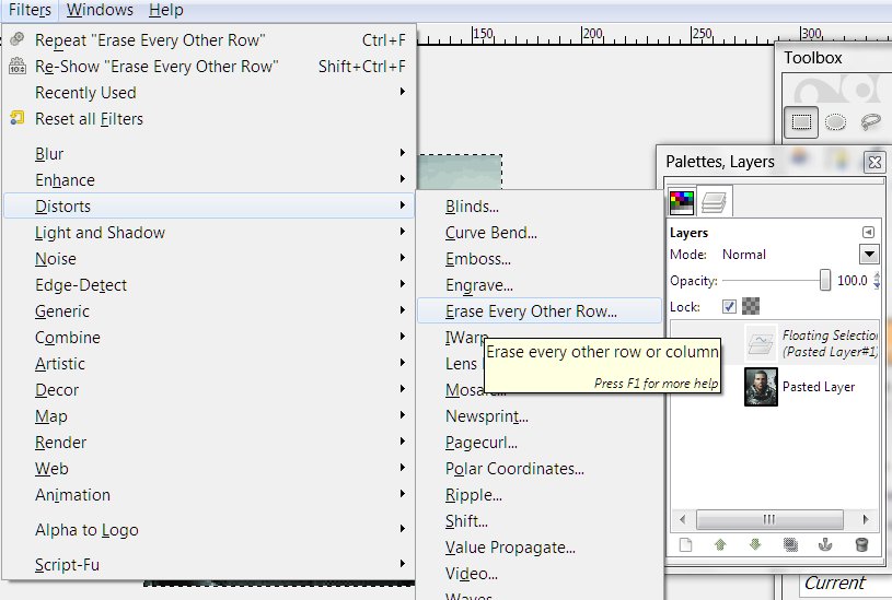
That's Filters>Distort>Erase Every Other Row. (Notice in the Layers box that the
second pasting I'm working on now is still a floating layer as long as I leave it
selected) -
This pop-up appears:
That's Rows (NOT Columns) Even/Odd doesn't matter, Erase.
Hit Okay, and you get:
Deselect and you get:
Notice the Layers box says just one layer now - no Flatten Image step.
That there's ready for [Ctrl]a, [Ctrl]c, and paste it back into the faction graphic. Easy.
Good hunting.
![]()
Transparent
Colors, the AC Palette Problem in GIMP and a Transparent Layer workaround
To my monolithic dismay, since I got back
into the graphics modding saddle recently [last November], finding myself confined
to GIMP for the moment, along with changes in the Windows 7 version of Paint and my own
rustiness, have left me a major learning curve I really didn’t expect. I never
thought I’d have to figure out yet another way to do scanlines at my level of
experience.
I certainly was shocked to find out I was getting the old ‘blue boxes around my
bases’ problem at THIS late date.

In short, anything you do to the transparent background purple (or pink if you’re
vanilla SMAC) will no longer be transparent in the game, and that naturally sucks real
hard. In Photoshop, sampling the background and doing a fill is all it takes to fix
it - GIMP doesn’t take care of as much color stuff automatically ‘under the
hood‘ for you, and replacing the exact same background color doesn’t work.
Loading the palette in GIMP doesn’t fix this.
-Also, there a shade of blue that displays a mustard brown in-game, but I’ve only
seen that be a problem with one faction that used that exact shade a lot in the
leaderhead.
I don’t know if this was a Windows 7 change or what. I’d like to know, but what
matters is that I found a workaround:
I assemble my factions in a blank .pcx. You can find a copy here: http://alphacentauri2.info/index.php?action=downloads;sa=view;down=65 (Look around the Downloads folder that file's in for a lot of other useful goodies and
remember who yer buddy is.) Open a copy. I'd advise creating a palette from it before
doing anything else - Windows>Dockable Dialogues>Palettes. Right-click on any
palette in the menu>Import Palette. Check Image, the second option, below Gradient, and
blankpcx.pcx(and a number) and import.
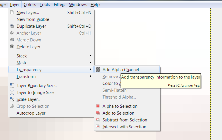
To get a transparent background copy to do the assembling in, Layer>Transparency>Add
Alpha Channel. Then Select>By Color>click on the purple background>Delete.
![]()
(Or save a step using the Select by Color Tool in the Toolbax indicated by the red arrow
above.) Now you should have the guide boxes and nothing else against a gray-checked
background (the gray checks let you know it's a complete transparency).
![]()
You'll need to Image>Mode>RGB to turn on a lot of the functions in GIMP (same for
Photoshop), especially color manipulation. When you’re finished and/or need to check
how a color will look in the SMAC(X) palette, Image>Mode>Indexed>check Use custom
palette>click on the colored square>pick the palette you made, and uncheck Remove
unused colors from colormap. (While it's in Indexed mode, you can reload the palette with
Colors>Map>Set Colormap.. - click on the Palette Default box in the pop-up and
choose your palette.)
When the faction is finished, or at least ready to test, paste the whole thing into an
unaltered copy of blankpcx.pcx ([Ctrl]a>[Crtl]c>bring up the unaltered copy with the
purple>[Ctrl]v) and Save As with the filename you want. For playtesting, I usually
replace the Gaians.pcx and have a look in an old gamesave with many Gaian bases - you'll
wanna back up/save a copy of the graphic you're replacing, or course.
It's harder to explain than do, really. It surely sounds complicated until you've done it
- then it will be no big deal.
Have fun.
![]()
Creating a SMAC(X) Faction Logo
As has become my recent practice, I’ll be giving details of which buttons I pushed in
GIMP - for instructional purposes, it seems to be the best choice for a powerful graphics
program available for free to all…
So, for the SMACivilization SpaceMayans (the Astral Jaguar Cult) faction logo, I chose
this shot out of several Alexander had posted:
It was perfect for our needs and wouldn’t be difficult to convert.
I cropped it down to the full-color shot in the corner

(Rectangle Select Tool to make a box>Image>Crop To Selection). I cranked up the
contrast 60% and darkened 30% (Colors>Brightness-Contrast) to bring up the black lines,
mostly. We’d talked about making the blue green, so I selected that part (Fuzzy
Select Tool with Threshold at 105) and hue-shifted (Colors>Hue-Saturation>top (Hue)
slider moved left until it was very green (-45 in this case)). The yellowish part was
looking distinctly orange now, so I did the same there (selecting it took more time at
lower power because the red part wanted to select, too - I had to click on the yellowest
pixels, then change the Fuzzy Select Mode to Add to the current selection at a threshold
of 25) then (Colors>Hue-Saturation>Hue +30). I was going for a typically Mexican
color scheme, too, thus green and yellow instead of blue and orange.
Then to get rid of the black border and give me a transparent background to work with
later, (Layer>Transparency>Add Alpha Channel. Fuzzy Select Tool at threshold 41
selecting the black background>[Delete].) I cropped out all that superfluous border
(Image>Autocrop Image) and deselected the empty space left. Because I wanted to bring
up the contrast again to bring out the lines, and raising contrast brings up the color
saturation, I lowered the color levels in advance (Colors>Hue-Saturation>bottom
(Saturation) slider -50%). Then Colors>Brightness-Contrast>Contrast +70%.

Then I loaded the SMACX palette to see if I was done yet
(Image>Mode>Indexed…>checked Use custom palette>clicked on my palette
file>unchecked Remove unused colors from color map>Convert) and I nearly was. I
Scaled the pink Eraser Tool down to 0.01 in the Toolbox and clicked Hard edge, zoomed in
and spent a minute erasing some very dark pixels around the edge.

The difference from the last shot doesn't jump out at you, but matters. If you're
not able/willing to nit-pick the fine details, you'll not make a very good grapics modder.
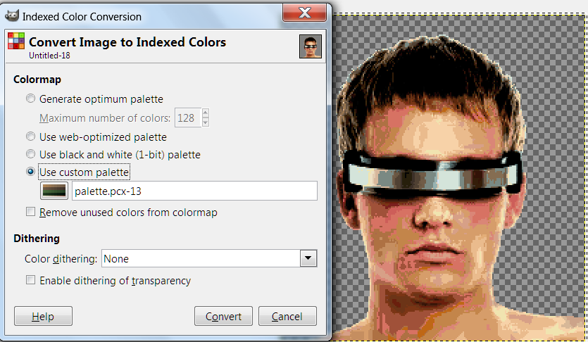
Now, time to paste it in. I loaded blankpcx.pcx, Layer>Transparency>Add Alpha
Channel, Select by Color Tool>click on the background purple>Delete.
![]()
I went back to the GIMP window with the logo I‘d just prepared, [Ctrl]a>[Ctrl]c,
went back to blank, zoomed in on the upper Council Logo box, the largest, selected the
inside of the box to measure how much space I had, (86wX72h - who can remember?)
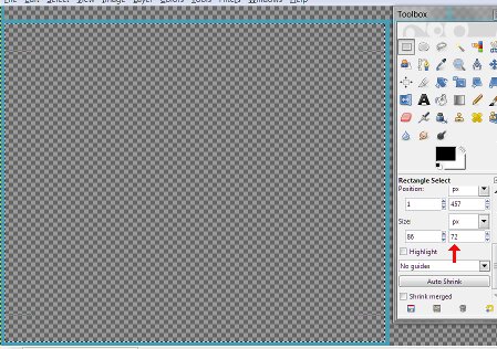
And pasted the logo in ([Ctrl]v) - surprisingly, it was already the right size.
That’s never happened before.
I repeated the process at the upper Report Logo box - it was one pixel too tall to fit, so
Layer>Scale Layer>reduce by one>deselect (Reduced proportionally{just as well
leave this one square}. Deselect to drop it in.) Then repeated the same process in the
lowest Small Report Logo box, and the Diplomacy Logo box, being careful to center it.
And then I saved as AstralJaguarCult.png (.png to preserve the transparent background
until I’m ready to save the final .pcx copy). I was done with this stage (I’ll
come back to this later and make the duller versions for the other boxes when I get to the
scanline part) unless Alexander wanted the logo more “outer space” when he sees
it, in which case I’ll suggest superimposing a (sacrificial) dagger w/ a glowing
light saber-ish blade. That should also keep me from having to re-do any of this…
Like most things graphical, I just took hours explaining something I could have done in
minutes - it only sounds difficult because I explain in such tedious detail for
instructional purposes. Logos are the easiest part -though this one was easier than most,
and sometimes I just draw something, which I couldn‘t do well enough with bases,
portraits and landscapes- you can do this.
![]()
The Artistic Side
of Leader Portraits - And Size/cropping the End Result
So, for the SMACivilization SpaceMayans, The Astral Jaguar Cult, Alexander posted this:
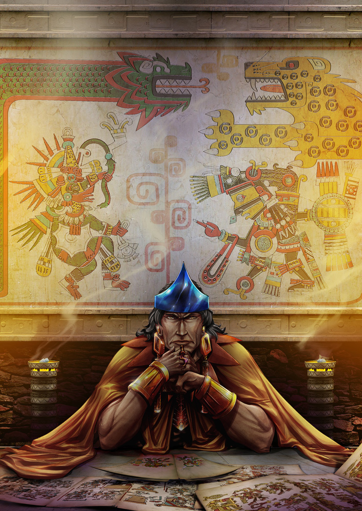
Now, I wasn't wild about this shot - it has a lot going for it; a beautiful background and
a strong sense of calculating, ruthless, personality in the figure - (the story-telling
part of Alpha Centauri is very important, and the look/attitude of the leaders is the most
important visual part of that) - but the face is drawn in a very stylized, unrealistic
way, with heavy lines and little or no sense of depth. Also, the blue crown thing looks
flat.
So, the first thing I did was set to working on the face with the Smudge Tool at small
Scale and low Rate; I won’t try to describe every little thing I did, as it would
take a week to write and no one would read it - also, I would still be working on it two
days later, because stopping to type what I did every time I do something slows me down by
a factor of ten, at least.
But I zoomed in close with the smudging at low power and started blurring the lighter
areas onto the black lines, smearing them into something more diffuse, like the shaded
lines in a real face, and less like drawn lines. I made the cheek lines around the mouth
more curved, eliminated or lightened all those deep, sharp, straight, unrealistic lines
radiating from the area where the brow, eyes and nose converge. I honestly can’t draw
all that well, but I’m a pretty good sculptor who has studied facial anatomy, and
using the Smudge Tool is rather like pushing clay around with my fingers.
I also used the Fuzzy Select Tool to pick out individual bits and fiddle with the
darkness, too. That was how I freed up enough light skin in the ridiculously lined bit of
brow under the crown to smudge around.
Basically, I did 45 minutes or so of smoothing out lines and moving shading around to give
the cheeks, especially, but the entire face, too, a more realistic sense of depth. I made
Montezuma a lot younger-looking in the process, which I hadn’t intended, but was
okay. I regret that making the anatomy of the nose look right changed the shape/character
of it so much…
I ended up with this:
Now, we’d already used shades of blue for two faction colors, so I immediately began
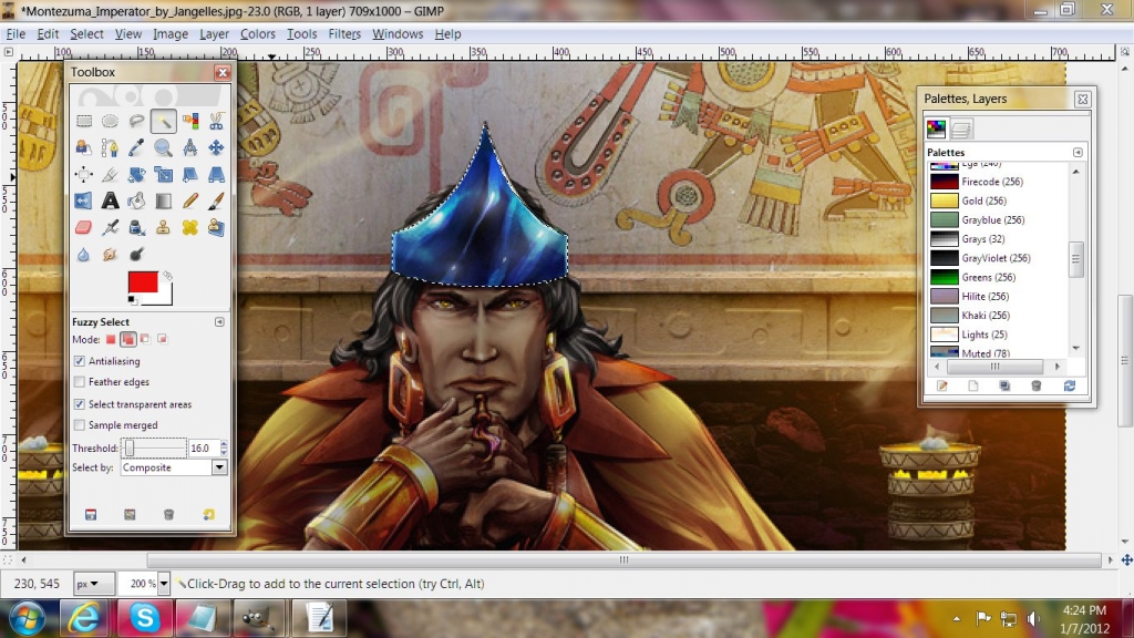
Fuzzy Selecting the crown. That involved spending entirely too long zoomed in very close
with the threshold set as low as 0.00 at times, selecting individual pixels around the
edges, and dark ones that wanted to spread the select to the background and/or the face.
Eventually, I ended up with the whole thing selected, as seen above.
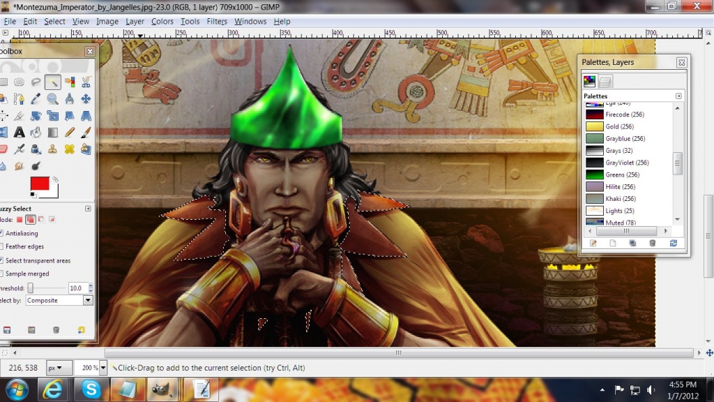
Then it was simple to hue-shift it over to a vivid green - remember from the logo post
that I was going for a Mexican red-yellow-green color scheme. Because this was for an
imaginary Mayans-in-Space faction, I actually stepped up the color saturation more,
and blurred it a little to make it almost glowy.
In my opinion, the yellow of the cape was too red, and the red of the mantle around his
neck was too yellow. More tedious Fuzzy Select pixel-choosing later, I had the above
situation. I brought the color saturation way down to get rid of most of the yellow and
used the Color Balance function to put the red back.
Then - oh. my. God. Selecting the pixels of the bracelets and the bleeping cape took
forEVER. Over two hours, I think. I can’t believe I do this for free. When finally, a
lifetime or two later, I had everything I wanted selected, I did the same as before - took
the color saturation way down, used Color Balance to put the yellow back, and cranked up
the contrast somewhat, trying to bring out the highlights and achieve a metallic golden
look - that last part didn’t work so well, but I did get pretty, yellower, cape out
of the deal.
As finishing touches, I selected few pixels of iris in those yellow eyes and made them
golder. I wanted to give the hair a slightly unnatural blue tint, so more Fuzzy Select
pixel choosing, and - it just made his hair look a lot blacker, but I liked its looks
better that way, so I left it. I kept making Monty look younger accidentally, but why not?
No story reason not to, and frankly, you want to cheat portraits towards looking young and
attractive when there‘s no reason not to, because people would rather look at young
and attractive.
I also decided to do something about the seeming flatness of the crown - the luminous
swirly bits made shading for depth a problem, but it was a simple matter of selecting a
pixel-wide strip at one edge of the crown where it curved around his head, darkening 40%,
widening a pixel, darkening 20%, repeating three more times, then going about 10% darker
for the next six or so. Then doing the other side the same way. Then doing roughly the
opposite in the center. It’s a subtle effect, and the glowiness makes it imperfect,
but the crown below does seem to curve around his head a little more.
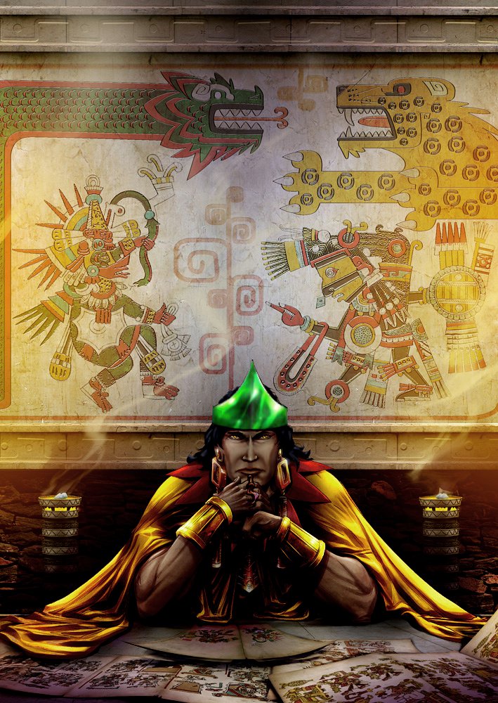
...
Now it was time for the size/cropping. This part is less artistic and far more mechanical,
so more how-to detail will be given than in the mostly why-to above.
I opened blankpcx.pcx and did the transparent background trick, then zoomed in on the big
datalinks portrait box, selecting it - the box itself, not the inside.
I copied, then switched back to the portrait, pasting it in to get an idea of the size
I’d need to fit Montezuma in the box.
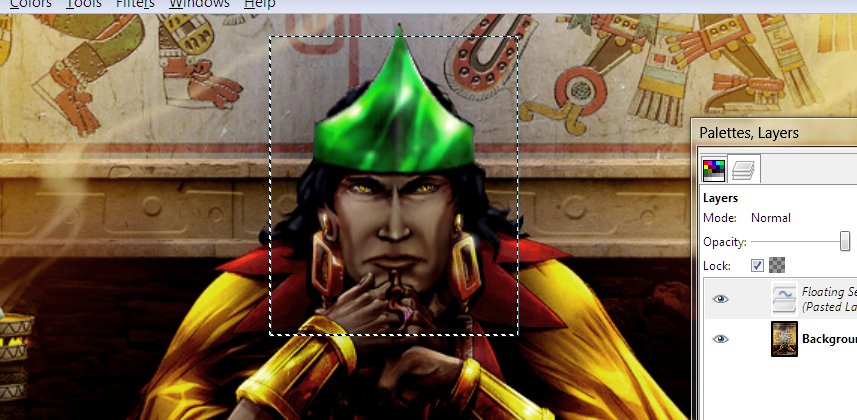
This was zoomed in too tight, so I hit [ctrl]z to undo the pasting, and reduced him about
60%. When I pasted in the box and moved it around, this was about right (A little +
appears in the center when I drag it around with the mouse, so it was easy to center the
box on the bridge of his nose, nearly between his eyes. Perfect - so I deselected.
Now I zoomed in as close as would show the whole box on my &^%$#@! wide-screen
monitor, 300%, and used the box as my select guide.
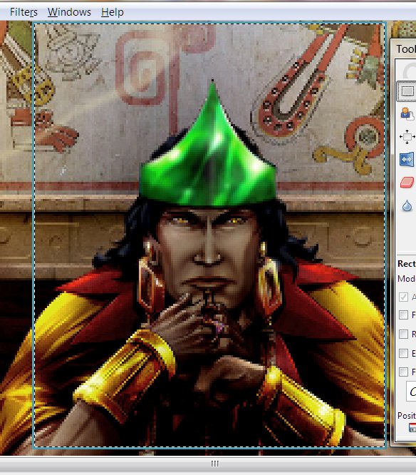
If I was working alone, at this point, I’d copy/paste into the assembly copy I
already dropped the logos into. Since I am collaborating, instead I Image>Crop to
Selection(ed), and saved a copy to post for Alex’s approval.
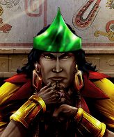
Today, he asked for a tighter crop. I gave him two crops, (My initial choice was
stronger, frankly, and the first below was rubbing his nose in it,)
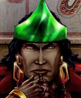
Full-size and 80%. He chose 80%, and now, with a little time spent making the molding
behind Monty a vaguely metallic blue to future the shot up a bit more, I can proceed to
drop it into the assembly graphic and move on to the bases. (The Diplomacy Landscape shot
goes so much like with the portraits that it isn’t worth a separate entry.)
Next: All about bases, some why and a lot of how-to.
![]()
Faction Bases: Making & Placing
[See also this closely related how-to, Cutting
Bases from Screenshots.
This one is posted out of order because a new friend was looking for help with
bases. References to transparent background and Montezuma will make more sense when
I post the previous two or three tutorials -ASAP- as I've skipped to my latest technique,
and several previous posts followed making this same faction.]
Bases can be pretty difficult to generate - I’ve drawn a few bases from scratch
-though I feel weakest at that- cut them from helicopter shots of real buildings and even
made one of Buster’s house from a photo taken from entirely the wrong (ground-level
and way too low) angle; (that last was a lot of work and involved a lot of drawing and
carefully selecting and distorting bits to get the angles right). The best source
tends to be structures found on the internet -whether from someone’s
computer-generated art or another game. You can also cut them out of screenshots
from other games yourself, as I did with most of the 8 bases sets I’ve posted in Downloads (check those links for
loads of bases ready to drop into you custom faction, as-is; three or four more base set
files are in progress).
Bases must be lit from the right, and must be at roughly a pseudo-3D 45
degree angle. You could make a base out a photo/image of a trashcan or a shoe if it
met those qualifications and if you wanted a stupid-looking base.
For the Astral Jaguar Cult, Alexander posted a picture of a base made from the Tikal
pyramid, alongside a photo of the original. I haven’t the foggiest what game it
was from [it was Age of Empires 2; that's the Mayan Wonder, as I've since cut out directly
from the game and posted at full size recently], but that there’s definitely a
pseudo-3D game base, so it MUST be from a game. It’s unfortunate that someone
chose to put it against a mottled background that isn’t all one color, but it’ll
be easier to cut out than a game screenshot, anyway (all the terrain details, figures and
other buildings can be a huge pain to tell from what you mean to keep while you're zoomed
way in [and it really was, too]).
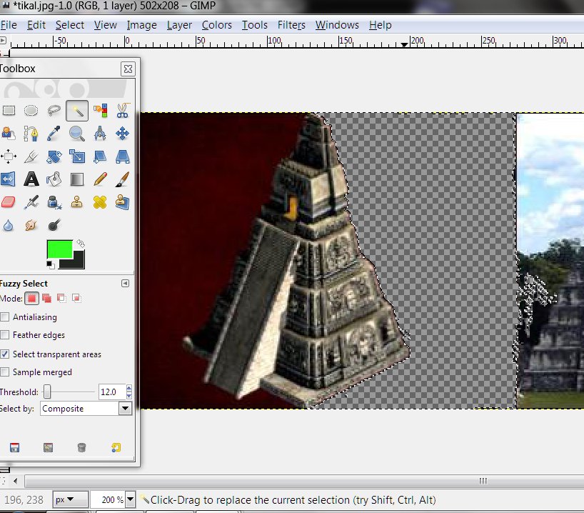
So, I opened the file I’d saved of it and Layer>Add Alpha Channel. The first
thing I tried was to Fuzzy select the whole background - sometimes you get lucky.
Not very lucky this time -the dark side of the structure & background didn't
want to toe the line- but I deleted this bit and than moved on to trimming it zoomed in
with the Eraser Tool fairly small Scaled (.10) and with Hard Edge checked (for many things
you'd want the fading of pixels you get without Hard Edge checked on the Eraser -edges
blend in better that way- but the indexed AC palette doesn't do semi-transparent pixels
and is going choose all the way on or off for each, so you want to pick which now).
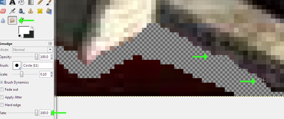
A minute or two erasing left this bit of edge ragged and uneven, so I used the Smudge Tool
scaled to one pixel and at 100% Rate to fill in a straight line(while [Shift]ed, you can
make a straight line, just like with the Pencil Tool) then reduced the Rate to 50% to do a
little randomizing of the shade/color of the pixel.
Then I went back to cutting a transparent zone out of the background - once I had cleared
a border out of the background around the edge of the base, erasing the rest would be
easy. When I got the entire dark side cut out, I reduced the Scale of the eraser to
one pixel and cleaned up what the Fuzzy select missed (you'd rather Fuzzy Select too
little than too much - it can easily eat into parts of the structure you're working on,
and erasing more later is less work than trying to redraw missing lines and such)
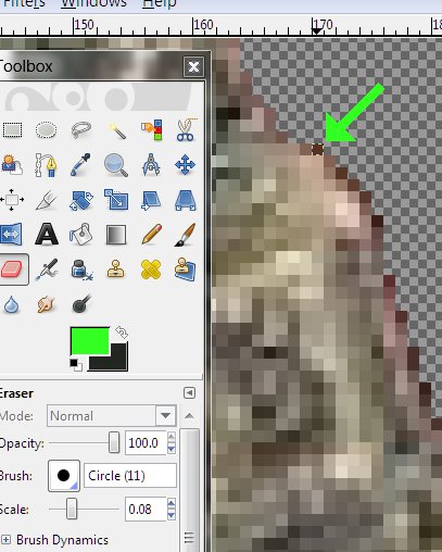
Eventually, I had this to show for my efforts:
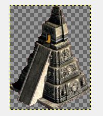
Alex wanted the light-glow from the door changed to blue to match the diplomacy landscape
picture, which wasn't much trouble. We'd also talked about silvering up some of the
ornamentation on the sides of the base, which was a lot more trouble:
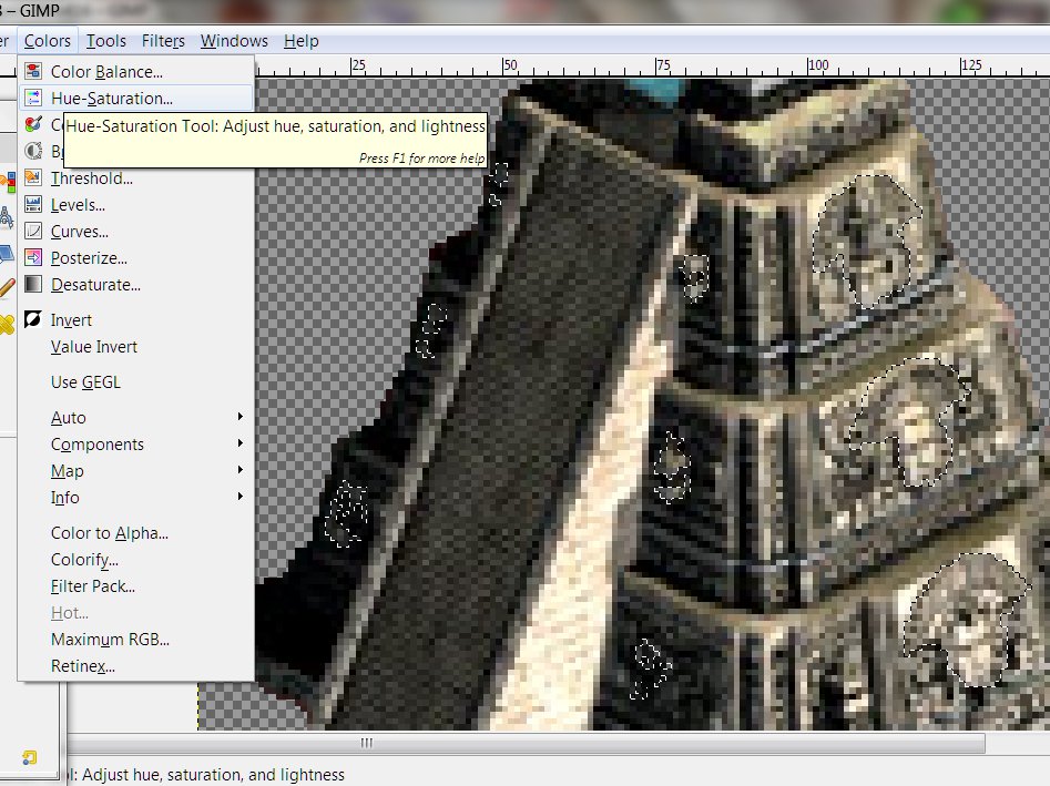
But eventually, I got what I wanted selected - nothing like as much trouble as Montezuma's
cape, though still a lot of work - and hue-shifted the results to a sort of pale blue with
the Color Saturation turned low enough to look not-quite gray, but not too blue; I also
did a little careful smudging of the headdress-looking bits, because some smoothness is
essential to achieving a metallic look.
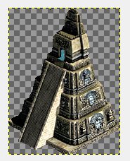
That got me this - which looked pretty good (notice that I'd improved the outline on the
dark side since two pictures ago, right after I'd finished cutting it out) and was finally
ready to drop it into the graphic. Again, as tedious as some of the work was,
writing and reading about it is more tedious than doing it.
So, after copying, back in the assembly copy of the whole graphic, I measured the size of
the box with the Rectangular Select Tool, pasted and resized, then positioned the first
base (the big stage four one to the right) and deselected.
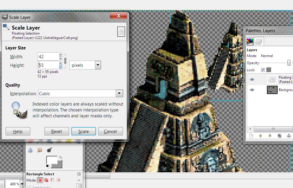
You want the base placed with the bottom cheated upwards if there's any room, and centered
left-right. SMAC(X) is very forgiving about placement, luckily, so don't kill
yourself getting it perfect.
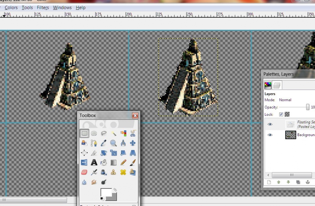
If it looks okay in the game when you playtest, you placed it well enough.
When I had all of the first row placed, I selected the entire first row and pasted in the
next five rows (Note that somewhere in there, I made a subtle goldening of some bits on
the largest base - the official bases sometimes have some special element to them to let
the player know at a glance that a base has grown to its ultimate stage):
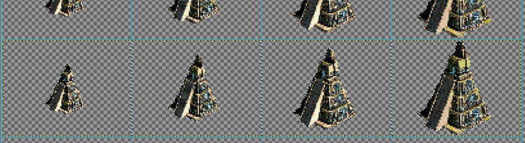
Notice that the edge of the select fills the row exactly - each stage of base is placed exactly
the same as the row above/below - which is for a reason and about to save you some work in
the next two steps.
So for sea platforms, I do a very simple thing; I use the Ellipse Select Tool to draw an
oval lined up with the bottom corners of the base:
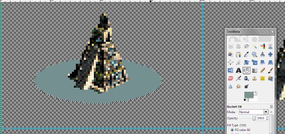
And flood the select with a blue-green-gray shade with the Bucket Fill tool (with most
bases I have to erase the bottom of the base do a clean flood fill and then repaste the
base back over it, but these skinny pyramids saved me a step). Then moved to
the next base and did the same, then the next and the next.
This is a crap way to make sea platforms, yes; for my very first all-original faction
graphic, I spent a lot of time drawing a raft to place Buster's house on. Since,
I've usually just skipped the platforms entirely, so at least doing this is better.
I followed up by drawing a darker edge on the bottom of the platform to at least make it
look real, if not very detailed - you can see it a little in the screenys below; it'll
make a difference in the game. (I WOULD go to more trouble for an aquatic faction,
of course, and you may/should choose to be less lazy about it in general.)
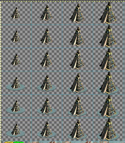
I only had to do that four times to complete one row, then I copied and pasted it over the
other two seabase rows.
Now, time to place the shields; I opened my Bare Shields file, transparencied the background (so
I could crank up the Fuzzy Select Tool Threshold real high and not have it select anything
but the shield I was wanting, all in one click) and started pasting shields OVER bases.
(I'm using the alien shields on this project for two reasons - they are so much
better-looking and easier to work with than the human shields, and these factions are a
set, from a different background than the official factions. You'll want to
use the alien shields for everything, but for consistency, try to restrain yourself if
your human custom faction is going to be played alongside the originals, and use the
fences unless you can think of a story reason your faction would have the alien tech.)
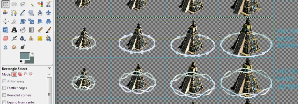
This is over halfway through the shield-adding process. Once I had dropped in the
shields centered on both rows of the land bases, I selected the upper part of the
bare top row and pasted the top over the shielded ones, to cover the shields where they go
behind. Notice the difference in the lower row with the stage two shields, as they
have the shields dropped in, but haven't gotten the top pasted back in yet.
Note how the yellow edges of the pasting match the inside of the box edges - this is why
you copy the first row over and over - as guides and because that way, every stage one
(stage two, and so on) base is placed the same so you can do easy paste-overs a whole row
at a time. Much easier to do than describe for teaching it.
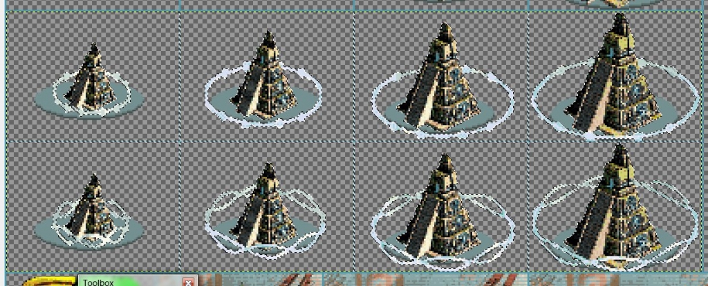
Notice in the above shot that the sea platforms haven't the dotted lines around
them - that's because I only shielded the LAND bases, and now I've copied them and am
pasting them over the platforms.
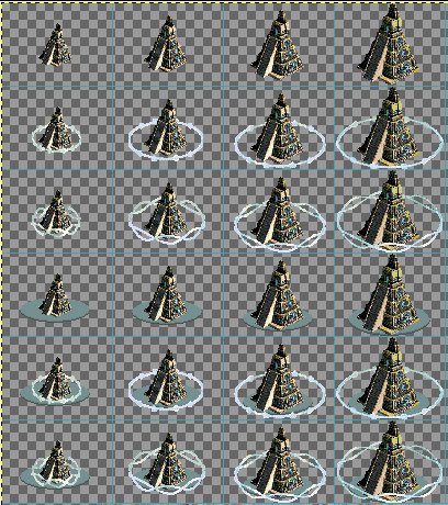
Now, everything is done on the faction, except the Diplomacy Landscape, which is like
working with the portraits except for only having to do it once at one size, and the
faction colors at the bottom of the file, which is like children coloring with crayons -
but I'll do a short post about it soon, as there‘s still many ways you can go
wrong…
![]()
Leaderheads: Two Showy
Examples of the Possibilities
This is from a 40’s Time Magazine cover:
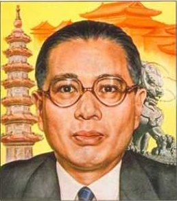
The pleasant-looking chubby mature gentleman is Tse-veng Soong, Chinese politician and
banker. He was President of the Republic of China for a few years in the late 40s,
reputed to be the only man the nationalists and communists both trusted. He was
Chiang Kai-shek’s brother in-law, and the richest man in China at one time, who
earlier had financed the Flying Tigers - out of his own pocket.
All irrelevant to the purpose of this article, but, a great man at the center of great
events for a good deal of his life, and at least in the US, pretty completely
forgotten. Worth looking up, if you like that kind of thing.
…
So, the cover portrait struck me as a fine leaderhead - I simply do not remember how I got
from that to setting out to do what I did - which was to make him a lot younger.
This was for an Asian faction leader to go with an artless custom faction of
Darsnan’s, so it surely resulted from discussion with him as part of that
collaboration.
-(much later) It took quite a while to track that conversation down, but Darsnan’s
faction was an alt. Hive, the Protectorate, led by one Kyong Shin, described as “a
person younger than Yang, and more determined/autocratic looking.” I posted two
promising-looking painted portraits of Chinese leaders and Darsnan chose Soong over Chiang
Kai-shek (I didn’t know at the time they were in-laws, Soong’s sister being the
famous Madame Kai-shek, whom I have also since used as a faction leader.) I
don’t see the intensity Darsnan wanted in Soong, though the subject began
younger than Yang.
Naturally, after so long I can’t be a great deal more specific in detailing the
process than if someone else had done it and I was speculating how. Reviewing the
exchange over it with my collaborator helps slightly.
First, I put him on a diet.
I narrowed his head -20% springs to mind- in MSPaint - this is back when I did all I could
in Paint. You can see the marks on the background near his head and where his ear
tips repeat.
Then, I pasted him into Photoshop and started working on him with the Smudge Tool, my
perennial favorite. The face needed general streamlining in shape, as simple
narrowing hadn’t gotten nearly all the fat in his cheeks. Of course I went
after the lines in his face, softening, and more often, removing.
I brought his hairline lower and a bit further in on the sides - always a youthful cue,
even in the un-baldest of older men. I added a widow’s peak, as Soong had what might
be the remnant of one and that seemed somehow in keeping with an intense personality,
looking a little predatory.
I narrowed his ears slightly to make them stick out less and because ears grow slowly all
your life, and are another subtle cue of age. I slimmed the tip of his nose a good
deal for the same reason, incidentally also adding to the intensity of expression I was
working toward.
I took out the smile lines, both youthening and, well, taking out smile
lines. I worked the puffy lower cheeks in until I got a gentle, non-chubby/jowly jaw
line - it tended to follow the hollow of the cheeks, making a nice, slender, triangular
face.
It was a very long process, time spent deep in creative right-brain mode as I ended up
virtually redrawing the face completely. Right-brain mode being what it is, I would
have had trouble detailing what I did in very high resolution at all five minutes after I
finished. A thing that surprises and impresses me now is that the posts I made at
the time indicate that I did the whole job in under six hours - it looks so thoroughly
redrawn that I’d been assuming I’d messed with it for days.
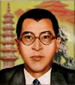
Ladies and Gentlemen, I give you Kyong Shin.
I fancied then that Soong might have looked like that in his youth, and have since seen a
photo at around that age - Shin could be his brother, anyway.
“Wow! Thats pretty high quality,” Darsnan said. This portrait
customization was how I found out I had real talent for this - I was very surprised by how
well it turned out. The quality of what you see is reduced a little deliberately,
because it looked so real that I worried it would look too much like a processed photo set
against a painted backdrop. The anatomy of the cheeks is off, but it looks like an
original creation, not an altered picture off the web.
All that was left to do was change his clothes. Darsnan wanted something North
Korean, so I redrew that suit into a green mao jacket. Clothes are like hair in
being easy to alter massively and get satisfactory results. I think, looking back,
that iconic as the mao style is, I should have futured the collar more - but it’s
hard to see any detail in the collar, even in the larger, pre-scan lined and SMAC(X)
palleted versions here, so it doesn’t really matter.
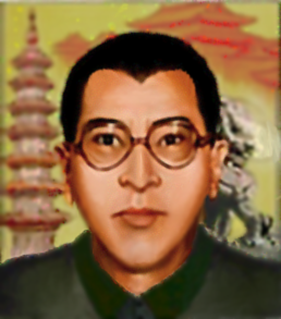
Kyong Shin has been my avatar at CFC for years - I wear one or another of my custom
faction leaders for an avatar everywhere, and this early work is one of the ones of which
I am still proudest.
………………………………...........................................................................................
I stumbled over this semi-colored line drawing while looking for a hippy woman to lead an
alt. Gaian faction:
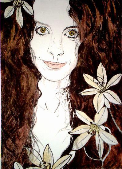
It looks very much like the sort of thing my sister had as posters hanging in her room
when she was young. The subject was framed in a non-traditional way for a
leaderhead, (which I assume is why Darsnan had me make something different for alt. Gaians
later), and too much work to turn into something I could use, but I just plain liked the
shot, and decided to have a go at it.
This one, I did on my own, and therefore have a lot less old post commentary to refresh my
memory about how I did it. But my purpose in this particular tutorial is not to tell
you how to do what I did, but to show you that it can be done, and figured out as you go,
by an untrained artist with little experience and little expertise in Photoshop.
However, here's what little that I do remember, just to get you started: first I did
a flood-fill, with the paint bucket tool, of a peachy Caucasian skin-tone.
Erred on the side of a golden tan, because a nature hippy is going to get some sun.
That filled less of the white space of her face and neck than you’d expect, and I did
some smearing around with the Smudge Tool on medium Threshold.
Coloring is easy; it's giving the work depth that's hard.
Now this next part is the big secret to converting a line drawing to a full-color painting
well: I selected the lines that defined her nose and jaw and turned them into a much
darker shade of the same peachy skin-tone, almost brown. (Shadows have a little less
color saturation, as well as being darker, because light carries color. That’s
why you see more-or-less in black-and-white on a moonlit night.) Then I worked the
lines with the smudge tool on low power, to blur them in realistically.
I did the same sort of thing with the lines defining her lips, eyes, and eyebrows, all
separately for the differences in color needed.
That was only the beginning. I used the dodge/burn tool to darken or lighten areas
to give her cheeks, and darkened her some eye sockets. Blended all with the Smudge
Tool. Made her some bosoms, and managed to not get carried away by making them too big or
too obvious. All much more complex than that, and I took a while doing it, but
that’s the basic technique. You just have to understand lighting and facial
anatomy, and be persistent. If I could figure it out, you can, too.
I was very happy with how it turned out:
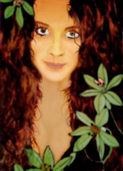
Attractive, and a little more mature, with a hint of intensity the original didn’t
have. I like. But this one was a bit of a heartbreaker - the freckles
didn’t make it through the transition to the AC pallet and scanlining.
I’ve also never gotten any word that anyone but me liked it. But I know good
work when I see it, and I did very good work here.
(Incidentally, I don’t see the problem with the framing - she’s just sitting
close to the monitor/camera. We don’t have to follow the official style
slavishly. We just want leaderheads that convey personality and look like they
could be video conferencing.)
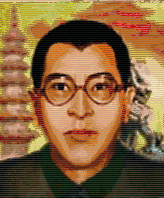
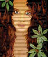
Good luck with your future ambitious projects; I have poor eyesight and had a
blurry monitor at the time, and had to figure these out as I went. You can
do it.
![]()
My First Faction Graphic
or: How I Got Started
Modding
SO, I’m like a lot of people; I played SMAC for years, and eventually got curious if
there were any goodies online - I think I downloaded the TNG-Picard “Federation”
and the Ric Fair Wrestlers faction off The Arrival 6-8 years ago, but couldn’t get
them to load/work and gave up pretty quickly.
In, I dunno, late ‘08, I finally got Alien Crossfire. I’d wanted it
forever and played with it over a summer a few years before until the loan of the CD
ended. Finally I had my own copy. I never thought it was much of an upgrade,
but new SP movies were a lot of fun after all those years, and I loved having twice as
many opponents to choose from - it lent some freshness to an old beloved game for me.
This swiftly lead to me rooting around back online looking for goodies again and to try to
find out how to get the custom factions I had to work, and straight to trying out SMAniaC.
Now, Maniac’s since become a pal, and I wouldn’t dream of badmouthing, but I
didn’t care for the SE changes - I guess I found the reasoning behind them too tough
to follow. But the seven custom factions he included - well, here was more
variety and freshness again. I got very interested in custom factions and resumed
looking for them and information about how to install and fix.
Probably everyone who’s ever taken an interest in custom factions has experienced the
same; there are a lot of custom factions out there that sound great in the description in
some forum’s Downloads section, but lose a lot of appeal when they’re downloaded
only find out they have no graphics, leaving you looking like Deirdre again, or
have the Free Drone graphics file renamed but unaltered again, or, thanks to the
antichrist of SMAC(X) modding, Facedit, the Hive or partly-customized graphics with the
Hive bases and often the logo and diplomacy landscape again.
(Do not touch Facedit, folks. It is so buggy and awful as to almost constitute
malware. There are much better ways to do every single thing it does, unless
you‘re very lazy and/or stupid.)
So I had six custom factions with a full spectrum of those shortcomings downloaded - not a
single full graphic in the lot. When I finally worked out how to load them into
SMAC(X) (had to fix the Wrestlers rules file first), no one but the Feminine Union had any
colors to their flags or text (which was illegible that way)- and Britney's color was too
hard to tell from Sister Miriam’s. It was even more annoying to have identical
non-colors for the rest; something had to be done.
Poking around, I saw the difference between the Union's .pcx file and the rest- there were
little color boxes in the lower left-hand corner (it’s a difference between SMAC and
SMAX, which you should always do because it’s easy and vanilla SMAC just ignores it,
so no harm, but essential for working right in Crossfire). After that, the fix was pretty
easy.
It also bothered me that The Eighth Faction, or Mindworms With Minds, defaulted to Gaian
graphics and colors.
I had an old copy of Photoshop5 that I never used, or much knew how to, because like all
high-end graphics programs the interface is very user-hostile to anyone who hasn’t
had a long time to become familiar with it. It would open the uncommon .pcx format,
though, and I wanted to play them Mindworms and not have them suck by looking exactly
like Gaians, so I set out to “put sunglasses” on everything to at least make
them distinguishable.
I think the first thing I did was paste the graphic over into MSPaint - say what you will
about Paint, but it doesn’t take a PhD and six months to figure out how to do what
can be done there. I think I tackled the bases first, doing some rather inept red
stippling on the bases to make them Xenofungusy. Remember, I was new to graphics
modding, not SMAC.
And I gave Deirdre glowing red eyes. Something about the nature of the faction and
those default graphics put the idea in my head that it was a result of a lab experiment
run amok, and visually mind-controlling Deirdre was my first step into the greater area of
the storytelling aspect of SMAC(X) that has been my real specialty, not just the art,
since.
It was a customization that I could do in under an hour now, but took a couple of days
then, what with figuring out how. -It is the nature of telling a story well that
even many relevant details have to be left out to keep the length reasonable - I was
rooting around all the official art files in my AC root folder on my hard drive, and
searching/figuring out answers to technical questions and doing some hardcore lurking
through old threads on SMAC forums, mostly ‘poly, all at the same time. All the
stuff was informing all the other stuff I did any given day/week.
So I did the most basic of art customizations to make the Mindworms individual - a little
red on the bases and a little red eye on the leader - then started fixing up the
half-done, half-Gaian .pcx files that came with the Cannibis League. Then I’d
get an idea about something else to do on the Mindworms art. I was working on both
for a couple of weeks and got into fixing up the Wrestlers, who had Believer bases and
needed improvements to the other elements, The Federation, which needed a real captain
(named Kirk), and custom bases, the Borg, with an excellent leaderhead and logo, but Hive
bases, and the Feminine Union, with its crapulent leaderhead of Britney Spears crying out
to be replaced with her in her Queen of Mars get-up from the Oops, I Did It Again
video - I was new enough to Alien Crossfire to not recognize the Usurper bases the Union
had, and someday, I’ll have to fix that, but I did create a neat logo to replace the
Firaxis spiral it had been given.
Then I commenced on my first all-original faction, the Pretty Princesses, based on/for my
perfect niece, five years old at the time - this was half her life ago. Custom
everything, completely original, including the .txt files, and I daresay the nicest bases
I ever drew from scratch, the house she lived in then.
It just kept snowballing, as did my enthusiasm - I ended up in a manic spell, getting as
little as four hours sleep a night, waking up itching to get back to it. This went
on for a month.
I don’t recall exactly how I went about it, but I tracked down the native life in
units.pcx and pasted a tiny mindworm onto Deirdre’s forehead. I made her skin
ruddy, as if her body chemistry was a little xenoformed. The .bmp of the mindworm in
the lab that’s in the SMAC(X) folder was also included with the files I'd downloaded
for the fation, a clear bit of authorial intent, and so I used it in the center of a
blanked-out red Gaian logo silhouette as the new logo - and superimposed the worm over the
diplomacy landscape.
I ultimately decided that the hue-shifting I’d done in Photoshop on the bases
wasn’t enough, and carefully placed the top of a fungal tower on the highest point of
the bases. There was no missing the Gaian origins, but no chance of mistaking the
two.
The final touch I later came up with was to flip Deirdreworm’s portrait
left-right. The thing was finally done.
(Note the joke in the bottom right corner.) What I did when to which faction is a complex
issue, but this is the first one I set out to make, and the first I finished. The
Eighth Faction is ridiculously overpowered, but in the game? The art hints at a
story, and it looks great.
And that’s how I got started.
![]()
Faction/Flag Colors
I’ve never really addressed the faction colors, because it’s pretty
kindergarten-obvious stuff, and there’s not a lot to say. But it’s still
possible to mess up, so a few remarks:
This is an Alien Crossfire thing, but you should add it to your faction graphics even if
you only have and care about vanilla SMAC. If you publish/share your work, SMAX
users will find your nice factions all crappy and broken, otherwise.
This is a blank version of what goes in the bottom left corner of the main faction.pcx,
crammed right into the bottom left corner:
![]()
It’s not brain surgery - here it is with colors, the very first thing I did in my
very first custom faction:
That’s a bright color alternating with almost black - (completely black is
semi-transparent for base shadows, and would look strange as a faction contrast
color.) You don’t want to deviate significantly from bright/dark, bright/dark,
bright/dark, slightly different shade for vehicle color - doing it that way is how it was
designed to work, and doesn’t look as good in the game if you try to get
clever.
Trust me; I wasted a lot of time trying to get cute with the color format when I was
starting out, and it just doesn’t work as well. The base names look fuzzy
and harder to read without the strong contrast. Same for the flags. The
borders don’t show up right on the map without bright contrasted with dark.
Don’t do what I did, and waste a lot of time trying to find a unique color for your
faction. 1.) There are only 255 colors in the game palette, and 3/4ths of them are
too dark and dingy to show up on the mini world map in the game, and 2.) 14 of what’s
left are already taken, and a few of the second seven are already a bit too close the some
of the first seven. (The minimap thing is important, though, and if you
don’t pay attention to it in play testing, the end users of your factions will tell
you about it.)
Just pick out a bright primary or secondary color that goes with the color scheme of the
other elements in the faction and don’t worry about it. Seriously. SMAC2
should have a better palette, but there’s no point trying to make factions for
it quite yet.
And that’s really all there is to say on the subject. Bright/dark, basic
colors, and spend your time worrying over the other elements that you have more choices
about.
![]()